Covid app
An app to minimise COVID-19 exposure risk to commuters
The challenge: Provide guidance, direction and timely information to help users decide how to best protect themselves in their commute and in their time in the office.
Platforms: Mobile application
Toolkit: Balsamiq, Sketch, Usability research, Red routes
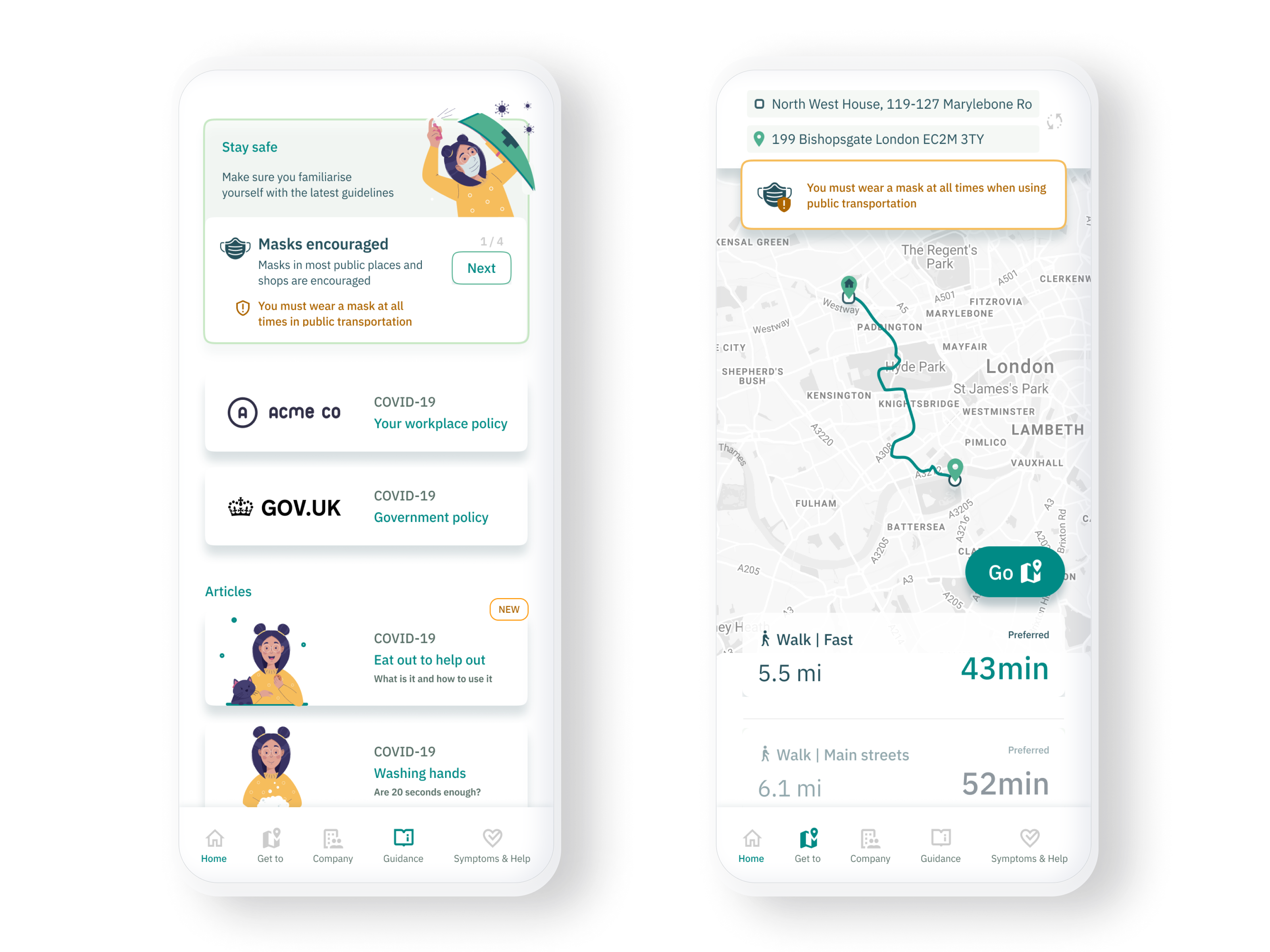
TLDR: This is a conceptual app to help users minimise risks of exposure to COVID-19 on their daily commute and during a day at the office. A case study to showcase my methodology for personal projects.
The pandemic has changed the way we work and has had a great impact in our daily lives. With fewer people going back to the office, if at all.
Working environments have started to change. Most companies are now more flexible with employee attendance or have adjusted schedules for those that wish to go to the office.
There is an opportunity to help those who want to commute to work, minimise risks of exposure to COVID-19 during their commute.
This is the concept of an app that allows users to find the best way to commute and safely book spaces at their place of work.
This case study details this exercise from concept to design. Starting with some base assumptions based on research and exploring from there.
Key guiding assumptions
As the quarantine measures for COVID-19 evolve and adapt, so do the methods of working for UK office employees. Office spaces continue to improve their working environment as per official COVID guidelines and the need for workers to have clear guidance to these policies emerges.
The majority of UK office workers consider a return to the office, they also anticipate things will be different with a higher degree of flexibility and remote working.
Government policy indicates that the process to offices reopening will be gradual and companies will have to follow best practices and official policies.
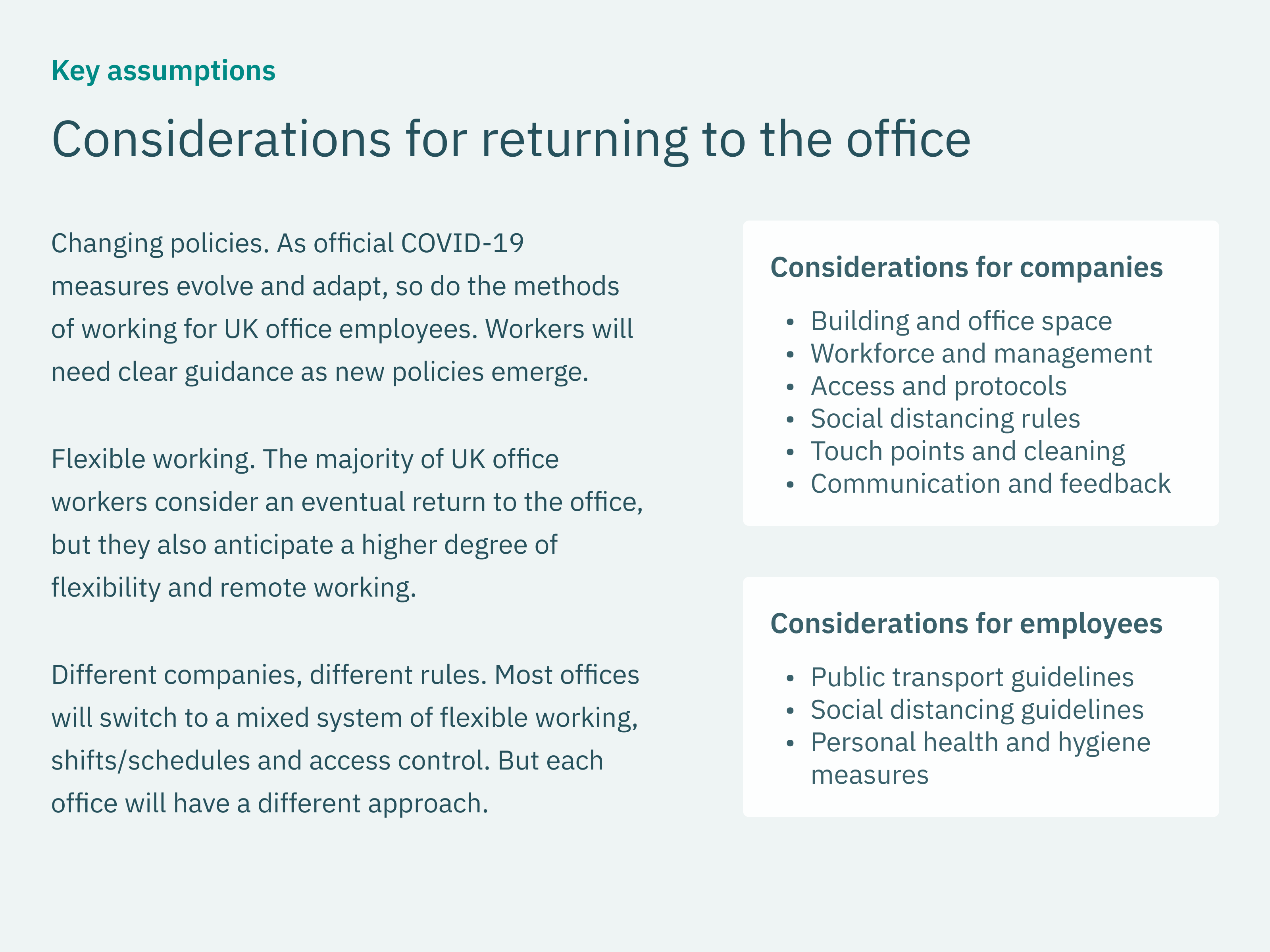
Consequently, we can also assume that most offices will switch to a mixed system of flexible working, shifts/schedules and access control. We should also see a small variation in implementation of government, company policy and guidelines.
Project plan
I proceeded with the assumption that the core goal is to help workers commute and decide how and when they should go to the office. Whilst at the same time, staying aware of any updates in traffic, office environment, company and government policy.
Prioritisation
We should expect each office to have a slightly different approach to guidelines (e.g signage, schedule, layout, workflow) and small variations in policy based on individual factors.
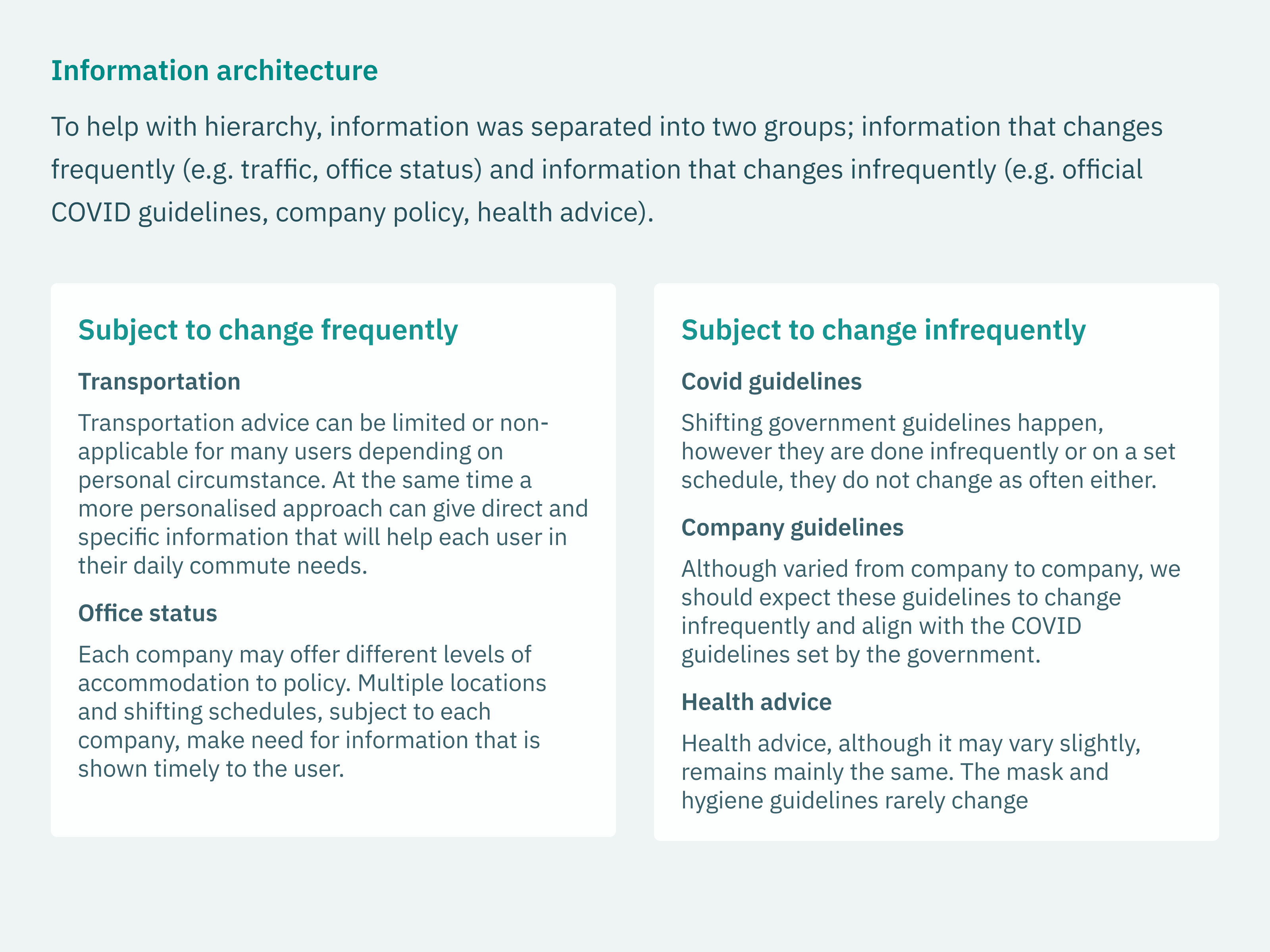
At the same time, we expect that guidelines and policies, on any level, can change status at any time. With a lot of these guidelines often being of contradicting importance depending on context.
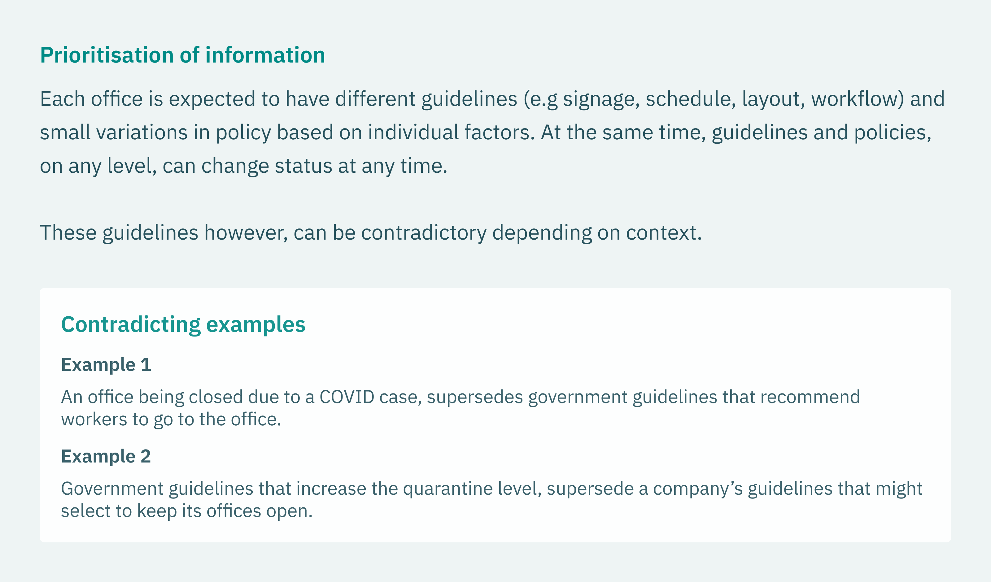
To help with hierarchy, I separated information into two distinct groups; information that changes frequently (i.e Traffic, Office status) and information that changes infrequently (i.e official COVID guidelines, company policy, health advice).
Key features
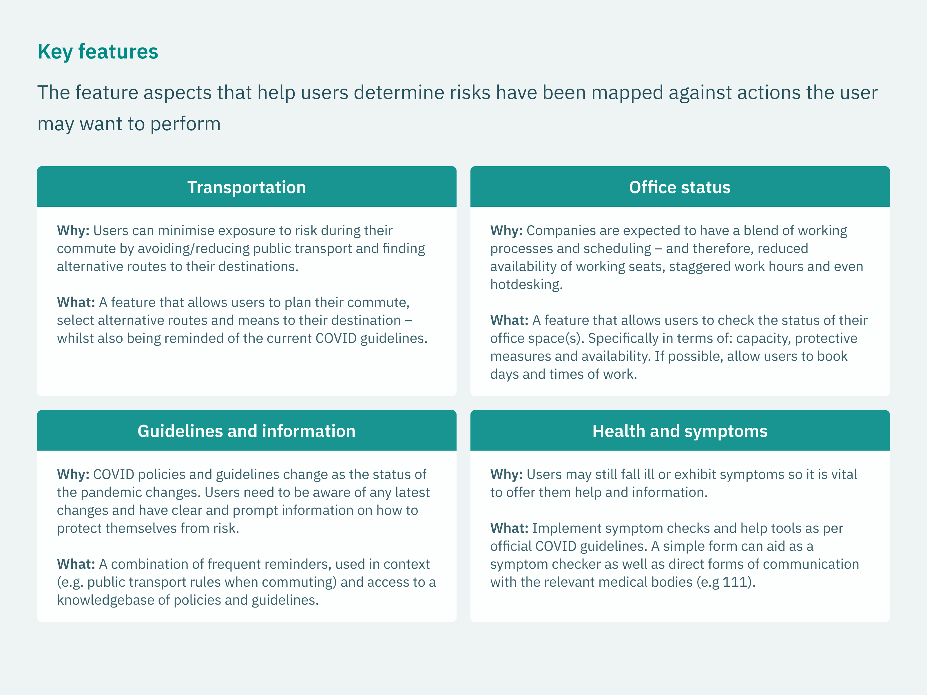
Having identified and prioritised the key pieces of information that might aid our users, I could now distill them into key features within the product.
Users
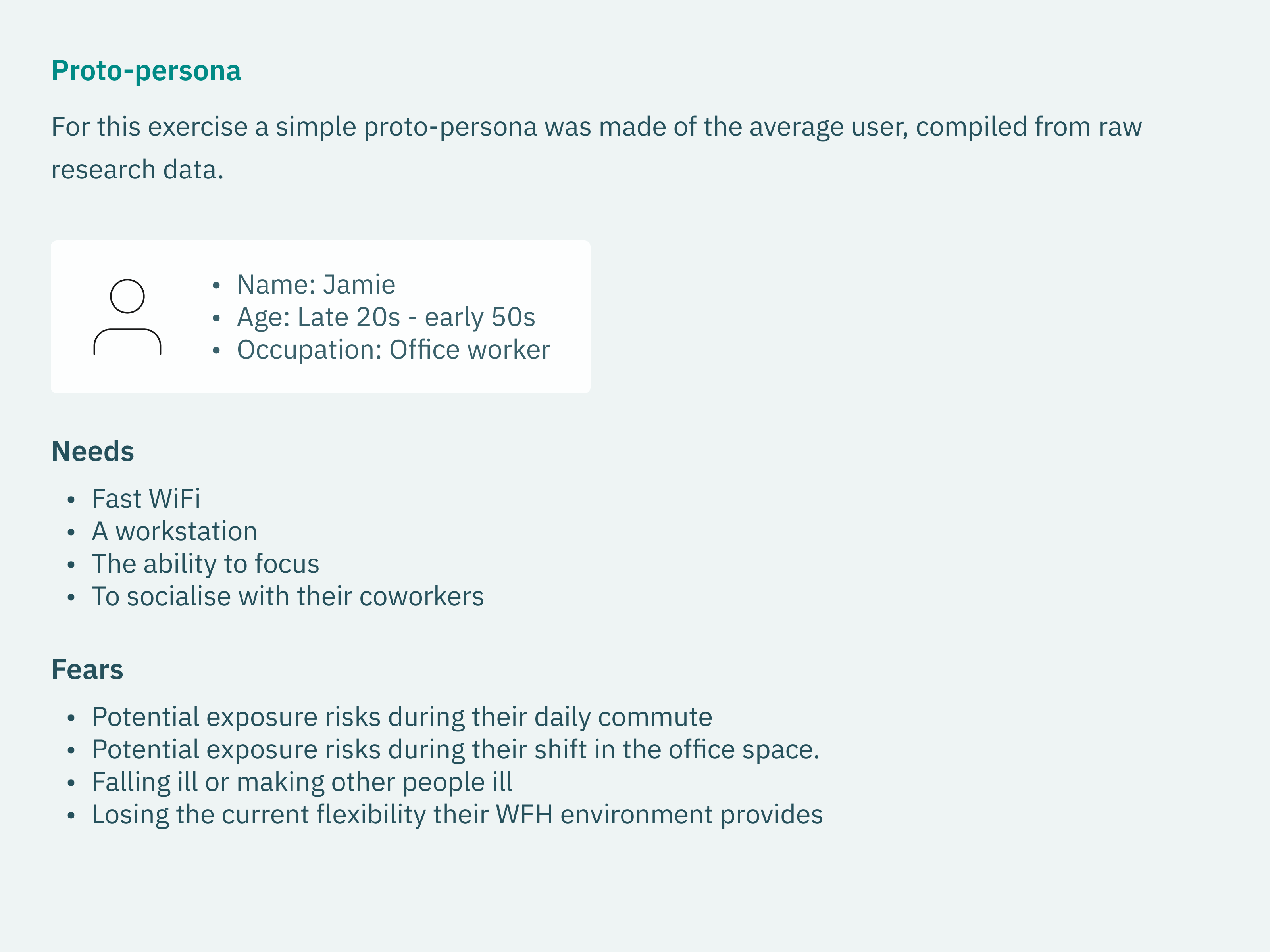
For this exercise a simple protopersona was made of the average user, compiled from raw research data.
Feature prioritisation
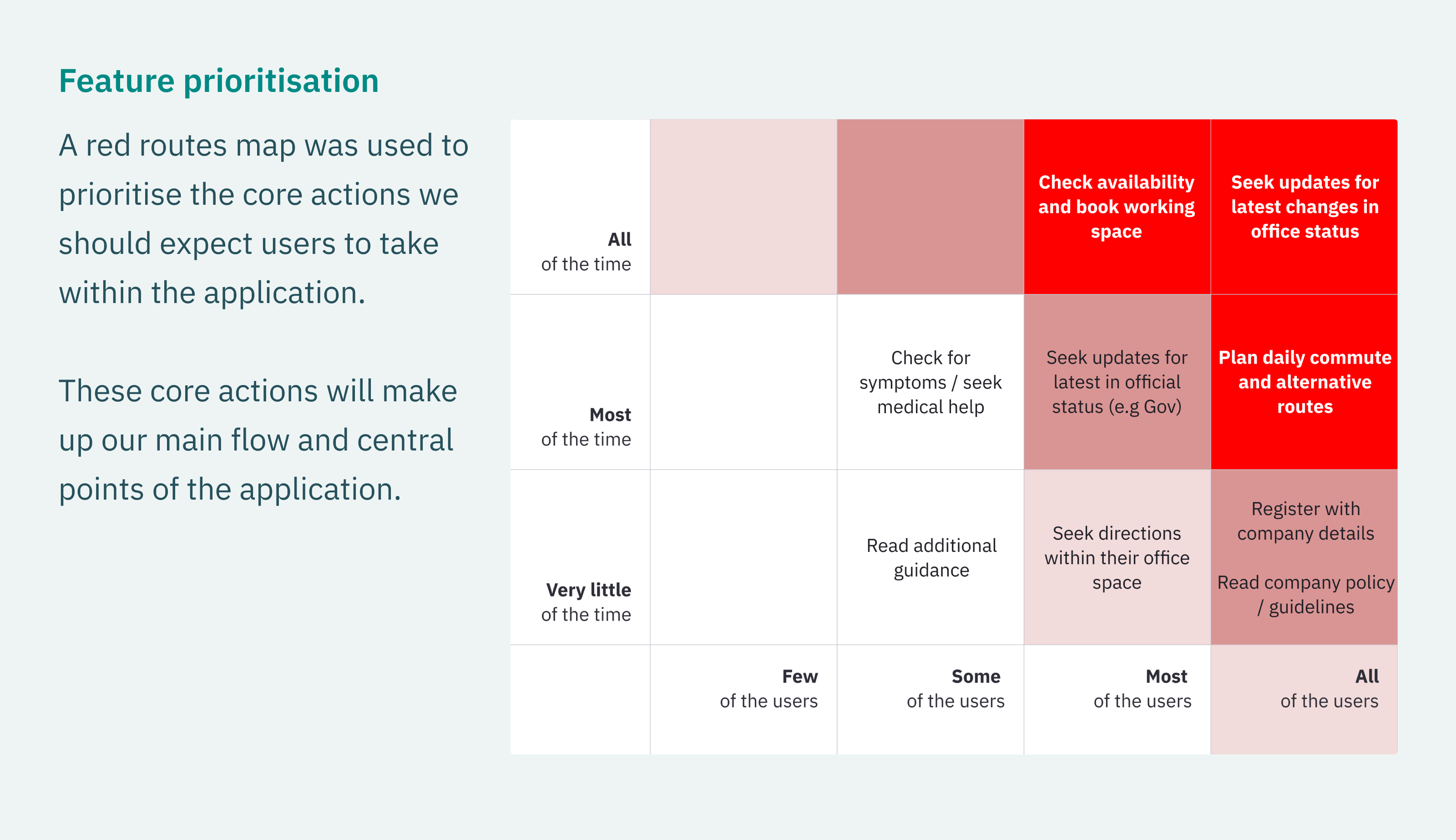
A red routes map was created to identify the frequency of core actions we should expect users to take within the application.
These actions will make up our main flow and central points of the application.
Design
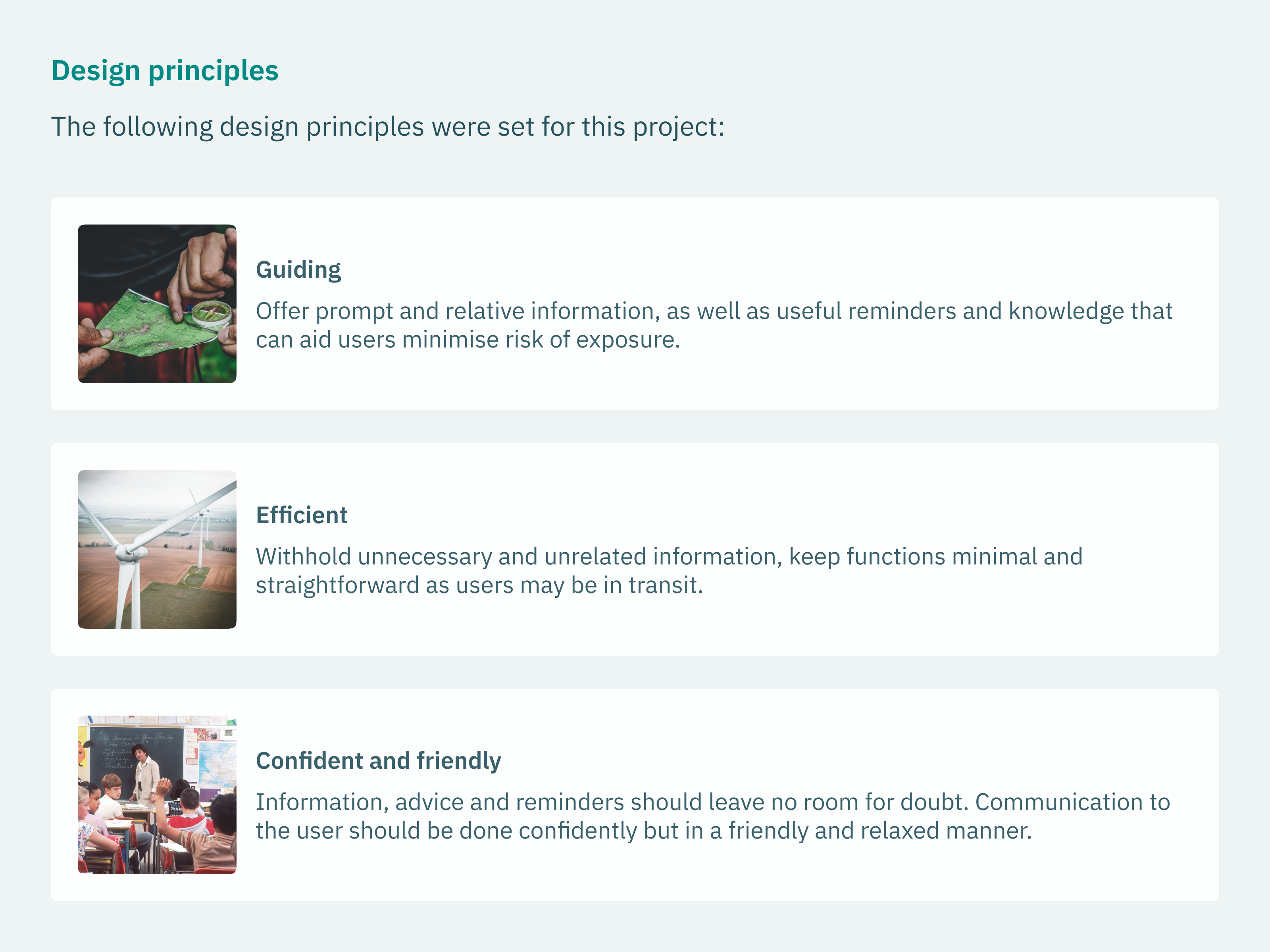
In order to design a potential MVP, I first needed to establish some design principles and the user flow of the product.
User flow
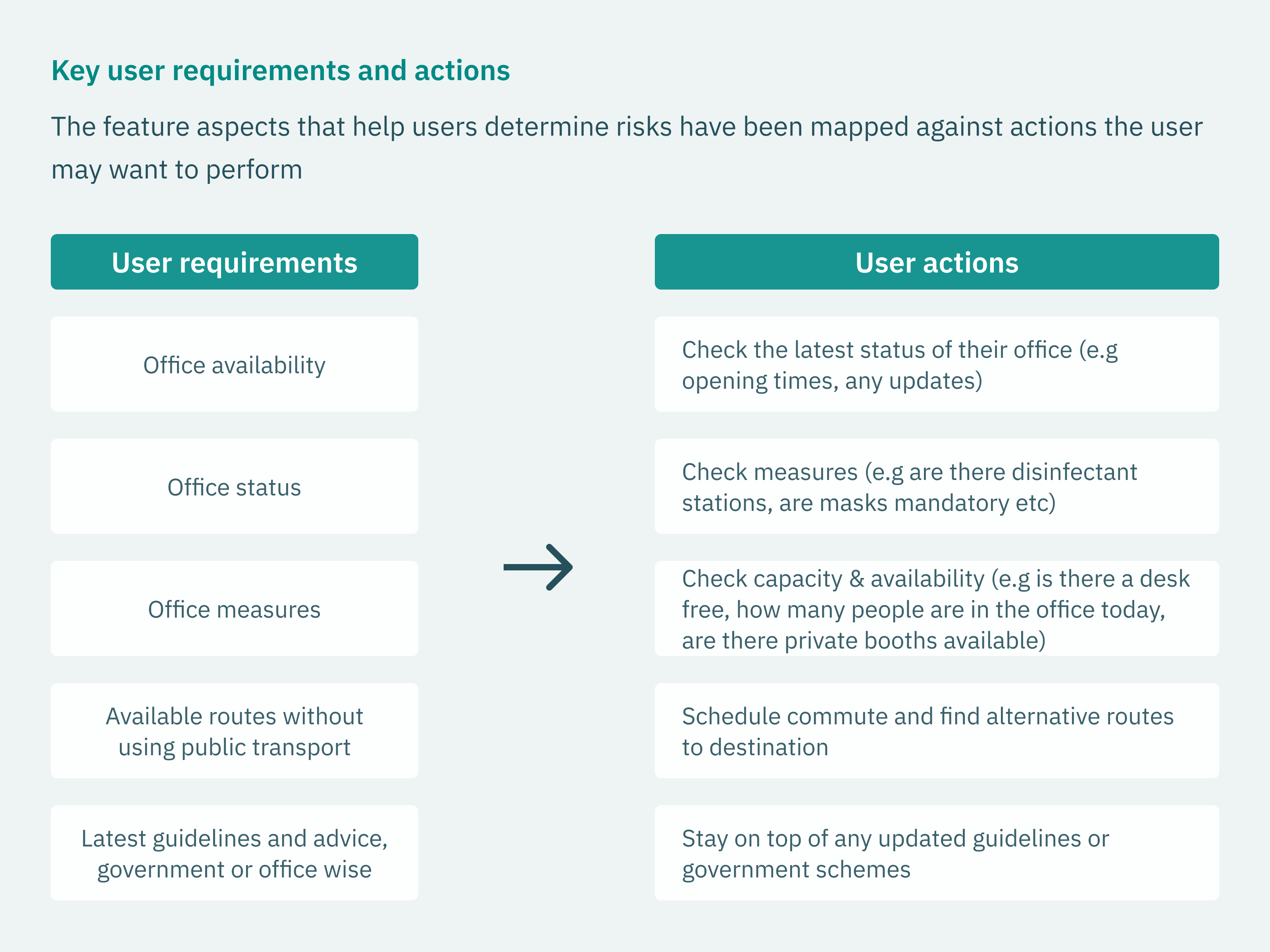
We can distil the feature aspects that help users determine risks as below:
- Office availability
- Office status
- Office measures
- Available routes without using public transport
- Latest guidelines and advice, government or office wise
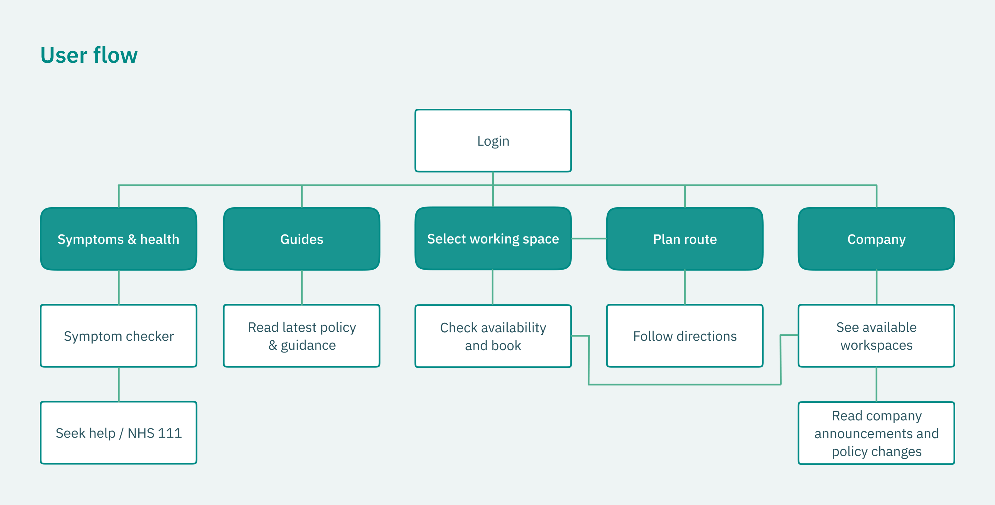
For this journey we estimate the user will want to perform the following actions:
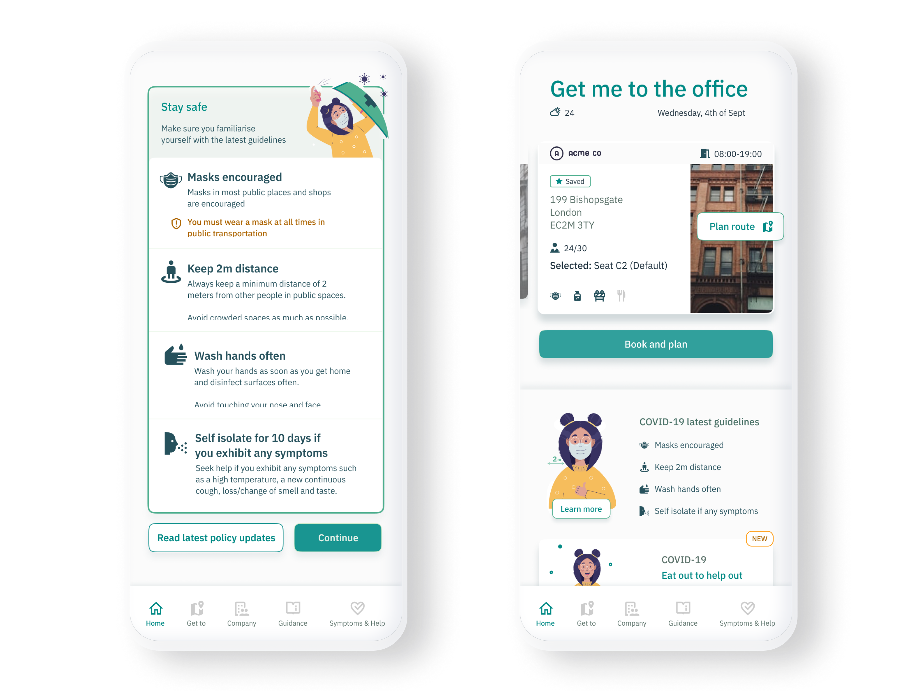
- Check the latest status of their office (e.g opening times, any updates)
- Check measures (e.g are there disinfectant stations, are masks mandatory etc)
- Check capacity & availability (e.g is there a desk free, how many people are in the office today, are there private booths available)
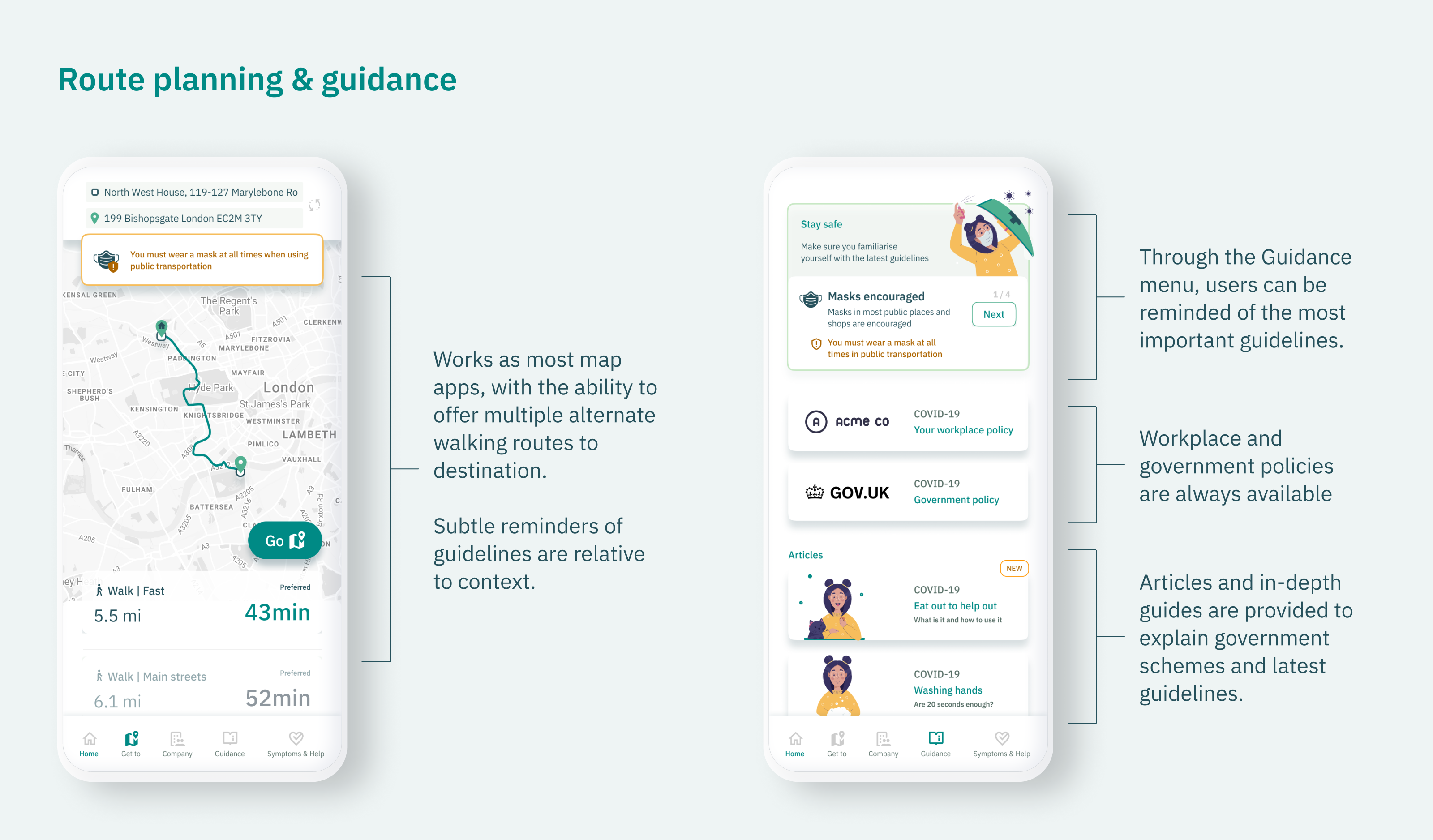
- Schedule commute and find alternative routes to destination
- Stay on top of any updated guidelines or government schemes.
Wireframing
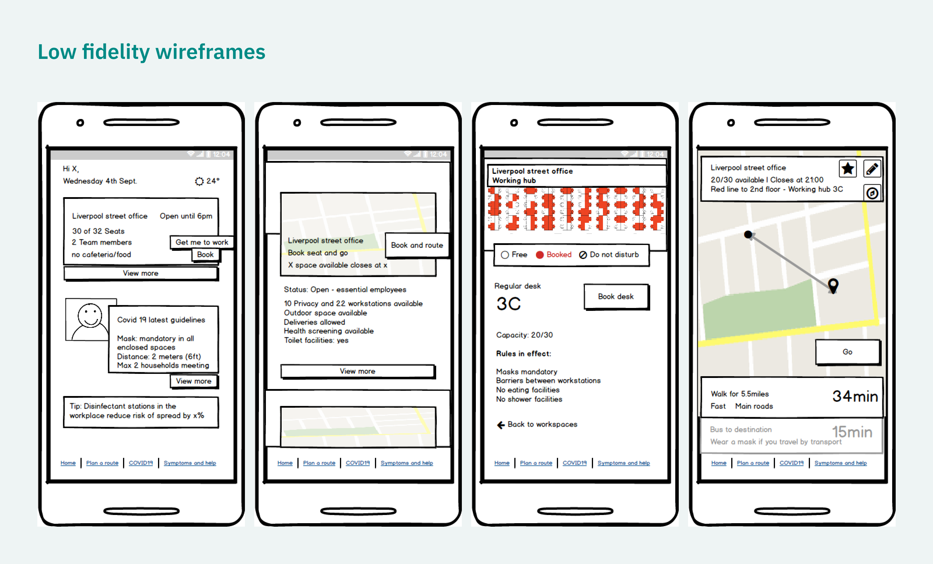
After that I quickly went to work and started drawing up low fidelity wireframes in Balsamiq to give me a good idea of what these steps will look like and what level of information I can add to them.
High fidelity
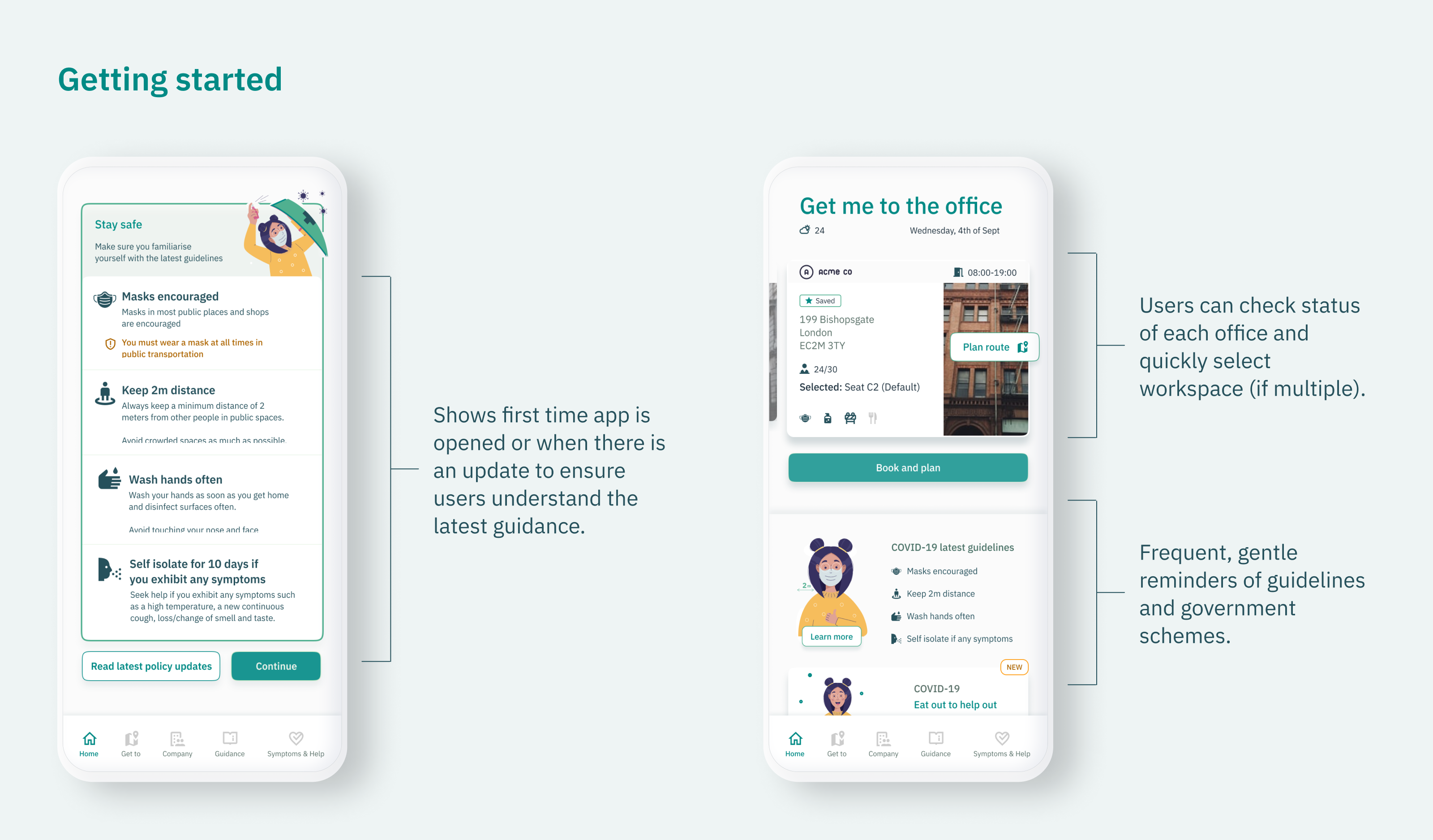
Finally, after a few adjustments in Balsamiq I started on fully fleshed designs.
Following closely the design principles established at the beginning, I have opted for a neutral colour scheme with friendly illustrations and iconography to provide guidance to users.
Final thoughts
Ultimately this is an app that will benefit from good ux copywriting. The right language is needed to communicate in a clear, informal and innocuous manner. For this app to become a tool that the users will use on their day to day tasks, during but also after the pandemic.
As a concept, this has been very engaging. However, if this was a real project I would like the opportunity to do some actual user testing with real users.
Further features/ideas I would like to see in such an app:
- Full sync with company calendars. See if your coworkers are in the office, get data for all the offices you can work in.
- Status indicators. If you can see other coworkers, allow them to mark themselves as DND.
- Push notifications and reminders. Reminders for upcoming office days.
- Foreign travel information. Latest government updates on international travel.
- The latest COVID statistics. Graphs/r-rate in your location or area of work.
- Cleaning status. General status or last cleaned for locations.
Is there a user need for such an application? Perhaps. But all in all, it was a fun exercise and a good problem to tackle.
References
Check your symptoms - 111. [online] Available at: https://111.nhs.uk/covid-19/ .
GOV.UK. 2020. Coronavirus (COVID-19): guidance. [online] Available at: https://www.gov.uk/government/collections/coronavirus-covid-19-list-of-guidance.
GOV.UK. 2020. Coronavirus (COVID-19): guidance and support. [online] Available at: https://www.gov.uk/coronavirus.
Ons.gov.uk. 2020. Coronavirus and the latest indicators for the UK economy and society - Office for National Statistics. [online] Available at: https://www.ons.gov.uk/peoplepopulationandcommunity/healthandsocialcare/conditionsanddiseases/bulletins/coronavirustheukeconomyandsocietyfasterindicators/27august2020.
BBC News. 2020. Coronavirus: 'Nine in 10 would continue working from home'. [online] Available at: https://www.bbc.co.uk/news/uk-wales-53946487.
BBC News. 2020. Covid: Should I be working from home or going back to the office?. [online] Available at: https://www.bbc.co.uk/news/business-52567567.
Experience London. 2020. Discover London by walking or cycling - Experience London. [online] Available at: https://londonblog.tfl.gov.uk/2020/07/03/walking-cycling/.
Science. 2020. Goodbye to open office spaces? How coronavirus is reshaping the workplace. [online] Available at: https://www.nationalgeographic.com/science/2020/04/will-coronavirus-end-the-open-office-floor-plan/.
nhs.uk. n.d. Symptoms of coronavirus (COVID-19). [online] Available at: https://www.nhs.uk/conditions/coronavirus-covid-19/symptoms/.Case StudiesGensler. 2020. U.S. Work From Home Survey 2020 | Gensler. [online] Available at: https://www.gensler.com/research-insight/workplace-surveys/us-work-from-home-survey/2020.the Guardian. 2020. UK office workers slower to return to their desk after Covid. [online] Available at: https://www.theguardian.com/business/2020/aug/05/uk-office-workers-slower-to-return-to-their-desk-after-covid.SurveyMonkey. 2020. Working from home: job necessity or just a great perk? | SurveyMonkey. [online] Available at: https://www.surveymonkey.co.uk/curiosity/work-from-home-survey-results/.