Krypto - Cryptocurrency exchange
Creating a user-friendly and accessible cryptocurrency exchange
The challenge: Design a cross-platform web application that provides a simplified and centralised cryptocurrency exchange to novice and advanced users alike
Platforms: Web responsive application
Toolkit: User research, Comparative assessment, User testing, Balsamiq, Sketch, Invision, Zeplin
TLDR: A Toptal client approached me to work on the exploration, research, and design of their cryptocurrency trading web application.
Extremely fun, yet this project was an exercise in balancing tight deadlines and limited resources.
The product was designed following a rigorous process of comparative studies, user research, and surveys. It also included user testing as well as ideation exercises during the exploration phase.
The MVP result is a dark themed, easy-to-use application for first-time cryptocurrency users who are looking into getting started with trading. The main aim is to lower the barrier of entry whilst keeping users informed and aware of their portfolio growth and performance.
The project is currently under development by the Toptal client’s engineering team.
Project scope
The scope for this project is broken in four stages:
- Planning & discovery
- UX questionnaire: To define the basic assumptions & goals for the product
- Design outline: A quick summary of design rules to offer clarity and alignment
- Research
- Learning plan: To define basic assumptions for the users of the product
- Survey: A collection of short questions sent to potential users of the product. This will define parts of the research such as personas and red routes
- Proto personas: A succinct way to project users’ needs, motivations and pain points
- Comparative assessment: A look into similar products to identify common offerings, features or lack thereof
- Red routes: What are the key actions users hope to perform within the product. This will help in ensuring the user journey facilitates those actions
- Design
- Design principles: Some base establishments about branding, look & feel,and tone of voice
- IA & task flows: To identify the most important elements and base user journey (on par with red routes)
- Low-fi prototyping: Sketches or wireframes. This will offer the first base interface for the product
- Testing & validation
- Wireframe testing: A quick round of user testing to showcase potential pain points and identify issues within the interface
- UX Heuristics: Ensure the product conforms with common UX Heuristics
- (Optional, based on time) Hi-fi prototype testing: A last round of testing to ensure the final product is as error free and usability friendly as possible
Planning & discovery
The first step was to define the core strategy that will inform the project brief.
By performing a UX questionnaire, the brief will be enhanced by defining the base assumptions for the product that will later on guide the research, design and the overall process.
At the same time, a design outline will set the ground rules as established by the brief. Given the open-endedness of this brief, some gaps were filled with personal preference and experience in order to turn this into a clearer vision of the end product.
UX questionnaire
The UX questionnaire is a vital part of the process, as it is the quickest way to surface considerations and problems in a new product.
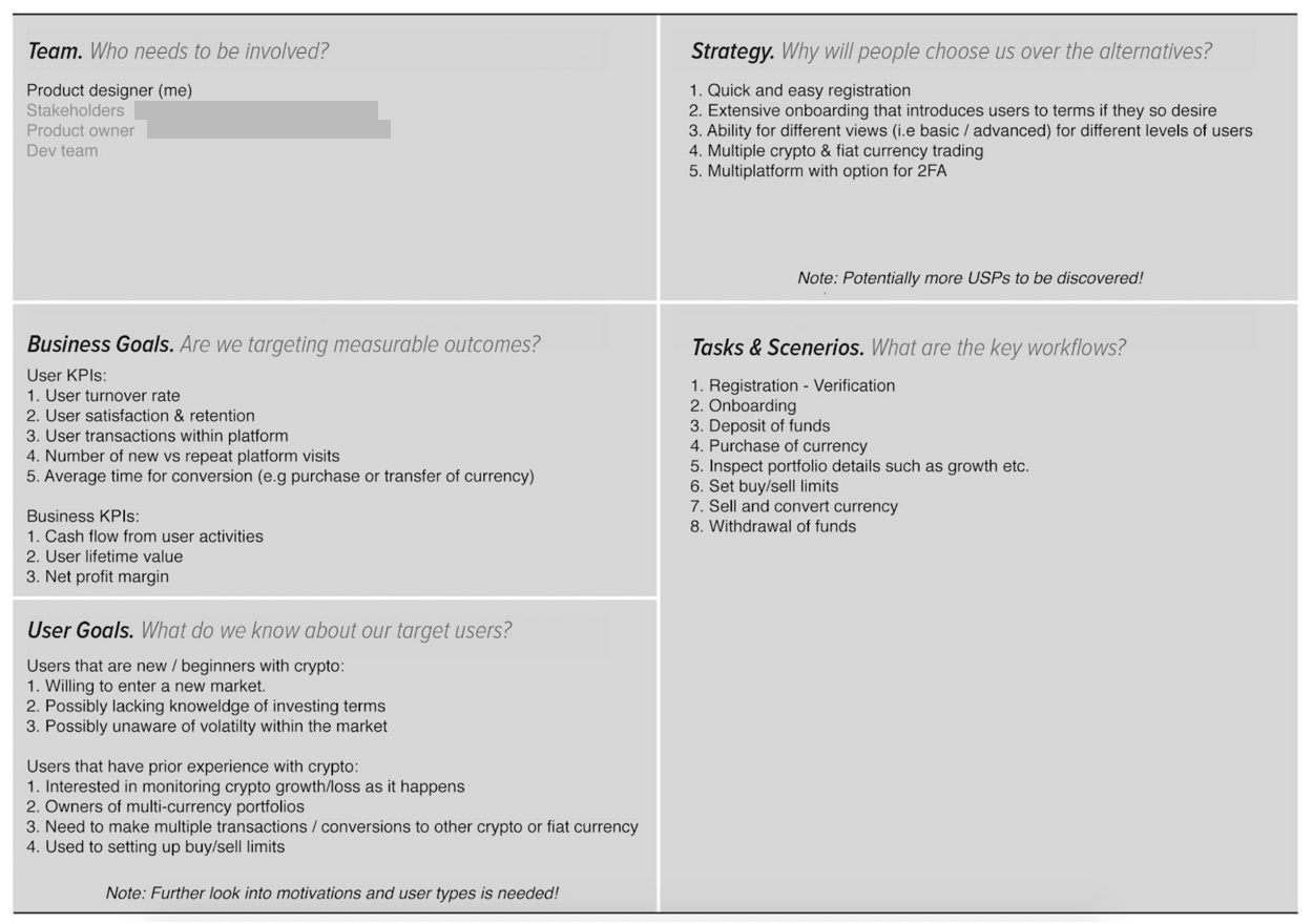
Design outline
A design outline is an ideal way to succinctly summarise the overall foundation of the product. It helps identify the defining aspects of the creative, such as the tone and purpose, as well as offer key guidelines to follow in the design process.
Research
After establishing the base needs of the product, the research stage follows. Common research methods such as surveys and market research will help validate the core needs and pain points of our users. These will later define the MDP (Minimum Delightful Product) for the first design iteration.
Learning plan
The learning plan is used as a guide to research that lists a series of assumptions for the target users.
By listing these assumptions, it was possible to categorise them and explore different research methods that will allow for further validation.
For the purposes of this project – and taking the short amount of time available in consideration – research methods were limited to
- a qualitative survey
- market reports & market research around common issues that cryptoexchange users face.
Survey
An eight question survey was conducted, targeting members of online cryptocurrency communities and groups in order to gather quantitative and qualitative insights to understand common needs and issues of a crypto-exchange user.
The decision to choose established cryptocurrency users was made in order to highlight common pain points and pitfalls that cryptoexchanges tend to fall in and the problems they encountered as new users.
By ironing these out, the barrier of entry for new users would be kept low.
The survey consisted of eight questions, asking for key information and it was kept deliberately short to ensure a high completion rate.
Overall the survey garnered 30 responses with variable results: https://goo.gl/m9scsp
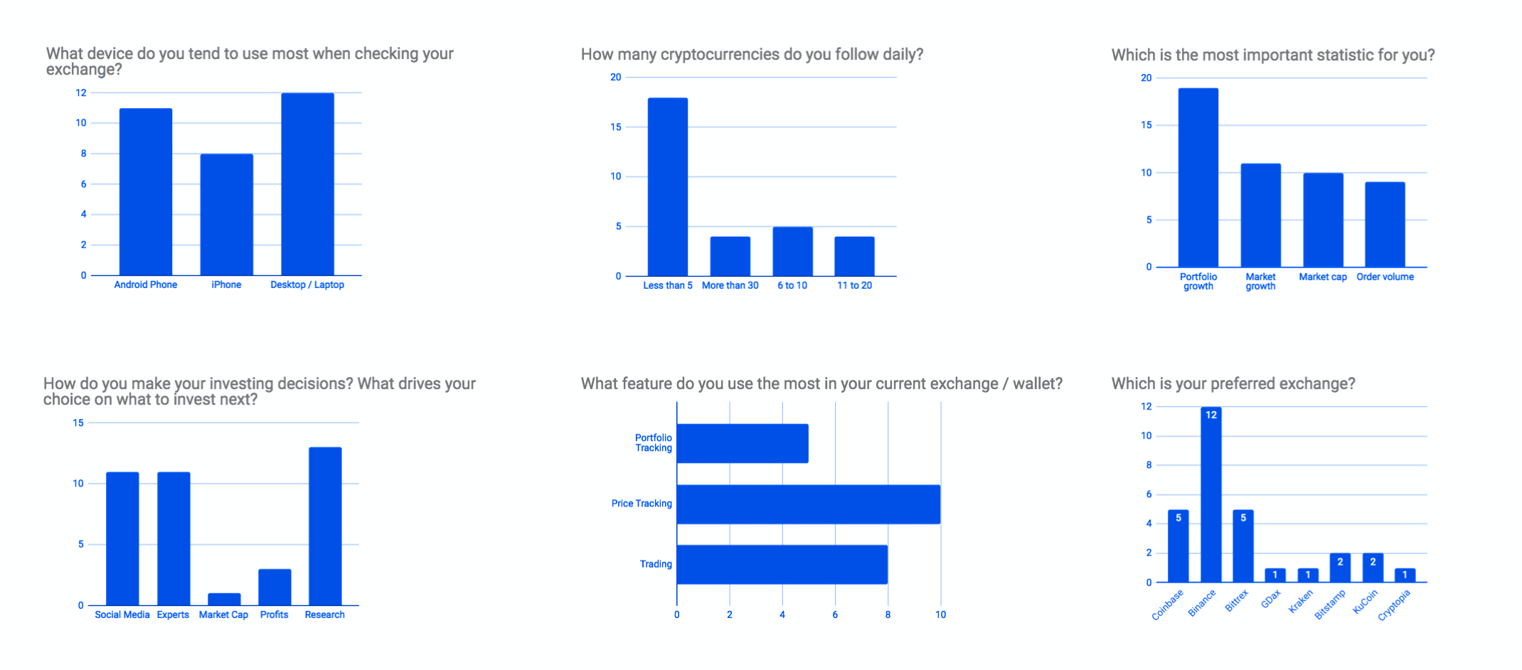
Quantitative data
The survey questions covered base behaviour trends such as preferred device, number of cryptocurrencies held, and the most important statistics for a cryptocurrency exchange user.
With some minimal data cleaning, the following charts were created based on the survey answers:
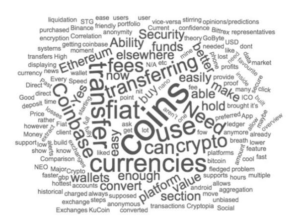
Qualitative data
A word cloud was also generated based on the qualitative questions of the survey. As can be seen in the image below, the words “coins”, “fiat” and “transferring were amongst the most used terms.
Summary of data
Based on the results, there was almost an equal split between desktop/laptop users (38.7%) and Android users (35.5%) with a smaller percentage choosing an iOS device when using their crypto exchange. The majority of users (58.1%) “hodl” less than five currencies and check on them on a daily basis, whilst the most prominent features resulted to be price tracking (43.5%) and trading (34.8%).
The most important functions were the ability to track their portfolio growth (38.8%) and the overall market growth (22.4%), followed closely by market cap (20.4%).
There was almost a three way split between the methods users utilise to make their investing decisions. With research (33.3%) taking the lead and then an equal split between social media (28.2%) and talking to experts (28.2%).
Lastly, users were asked which exchange platforms they use. Binance (41.4%) took the lead, with Coinbase and Bittrex (17.2% both) following right after and then an almost equal split to another five exchanges.
The top three pain points mentioned were:
- Unavailability of fiat currency (i.e trading in USD, EUR or GBP)
- High transaction fees
- The lack of speed when exchanging currency
It is also worth noting that many of the qualitative answers showed the choice of an exchange is heavily influenced by factors such as fees, security and speed, even if the platform itself offered a poor user experience.
A few users mentioned they would also prefer to see a full history breakdown of their currencies from the time they purchased, hence gaining valuable insights of the overall growth of their personal portfolio.
Ideally, follow up surveys should be performed to deep dive into some of these insights. But considering the time frame, these insights and data is a good starting point for our MDP.
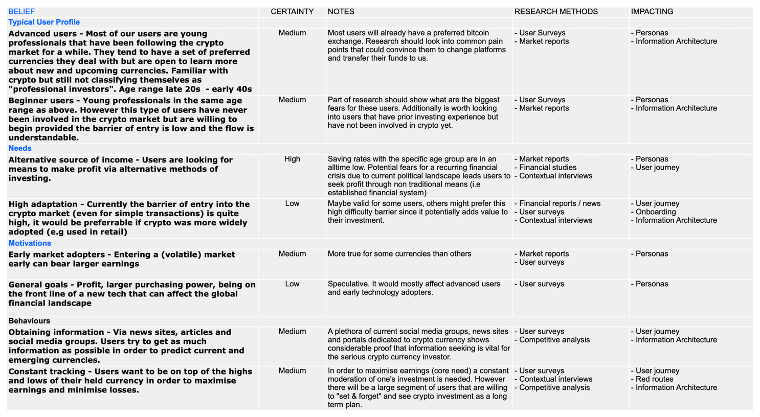
Proto personas
Two main personas were generated in order to describe the potential target audience of the exchange. The savvy crypto-exchange user and the novice.
Although they share a few similar motivations and pain points their approach to the platform might be different so considerations need to be made for both.
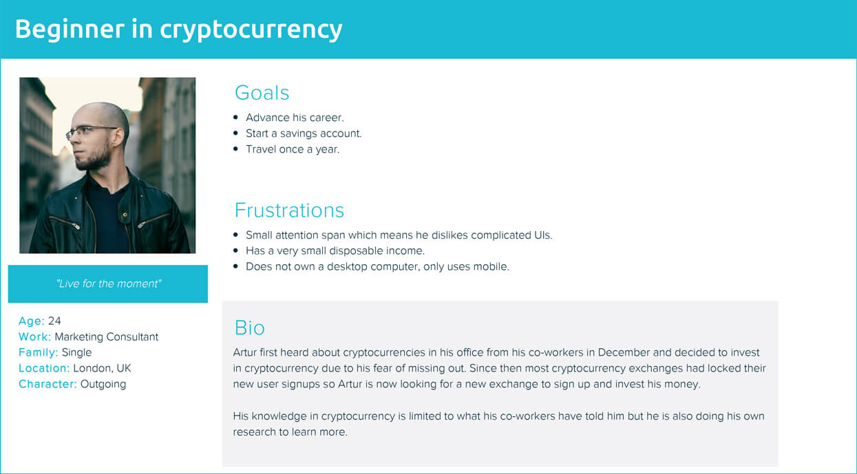
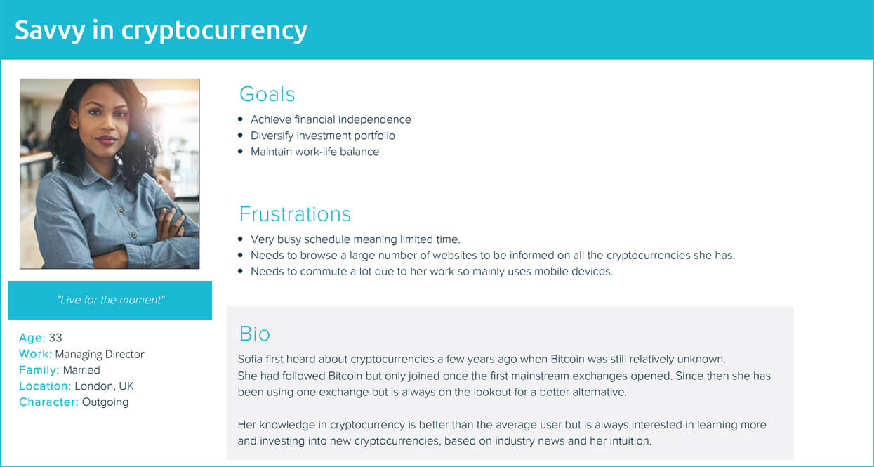
These archetypal users will help define the users’ needs and pain points clearer, at the same time give a better insight into their motivations and targets.
Common goals such as the need to increase savings and reach financial independence indicates that portfolio growth would be of equal importance for both.
On the other hand, pain points such as a dislike to complex UIs and lack of time specify the need for a system with easy to use actions that remain simple and approachable by both new users and returning users with limited time.
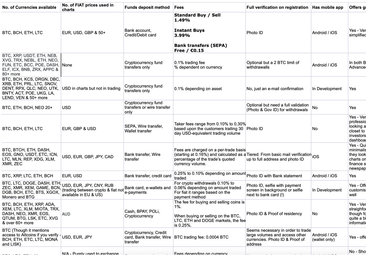
Comparative assessment
A comparative assessment is an exercise that investigates the functions of existing crypto exchanges. Based on the results of the survey (mixed with some Exchanges that seem quite popular online) a list of the most used crypto exchanges was created, their most commonly held currencies and some base features https://goo.gl/Tuc11S
There are many similarities between the existing crypto exchanges, such as: wallet implementation, live data visualisations and full account verification with photo ID. The most notable differences were in their positioning and messaging – such as how secure their platforms are.
UIs tend to be uniform across the board with clunky interfaces, complex actions and graphs that mostly display too much information for the average novice to make sense. Customizability is usually not an option.
In addition, the ability to set up alerts and the offer of a mobile app were also uncommon; only half of the listed exchanges currently offer an iOS/Android native app.
Lastly the most common currencies traded are Bitcoin (BTC), Ethereum (ETH), Litecoin (LTC) and Ripple (XRP). While most of them do not trade in fiat currencies, cryptocurrency exchanges at least provide value charts that translate the cryptocurrency to fiat.
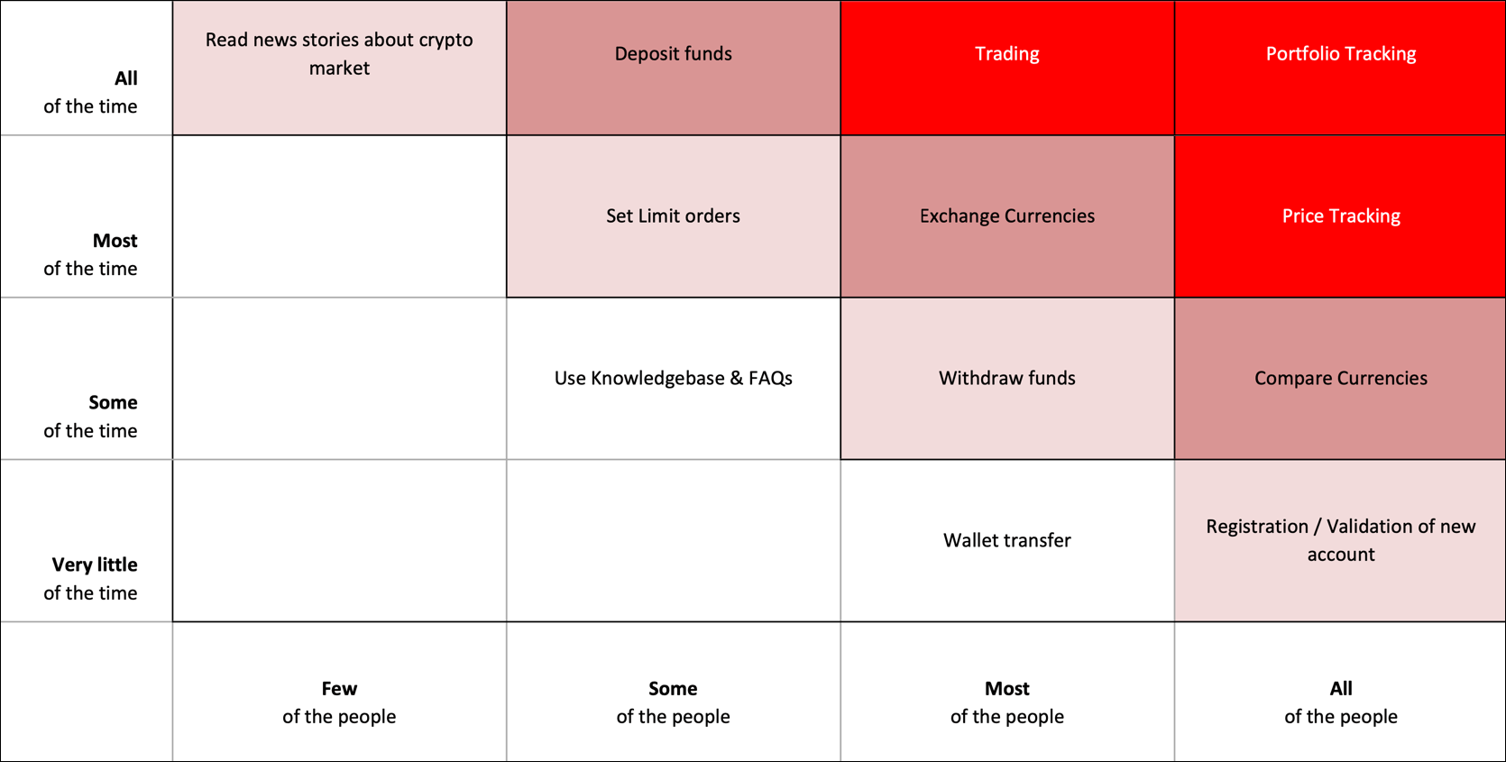
Red routes
Red routes is an exercise performed to identify key tasks that users will want to carry with the product. Red routes help define the absolute must of what the application should do in order to be successful. Based on this initial research, it was evident that the top three actions that will be used the most are trading, portfolio tracking and price tracking. The secondary actions that are performed by most users, such as validating a new account and depositing funds, are also important since they tend to be part of the standardised features most cryptocurrency exchanges offer. These actions will help define our MDP better and bring it closer to a fully fleshed out version.
Design stage
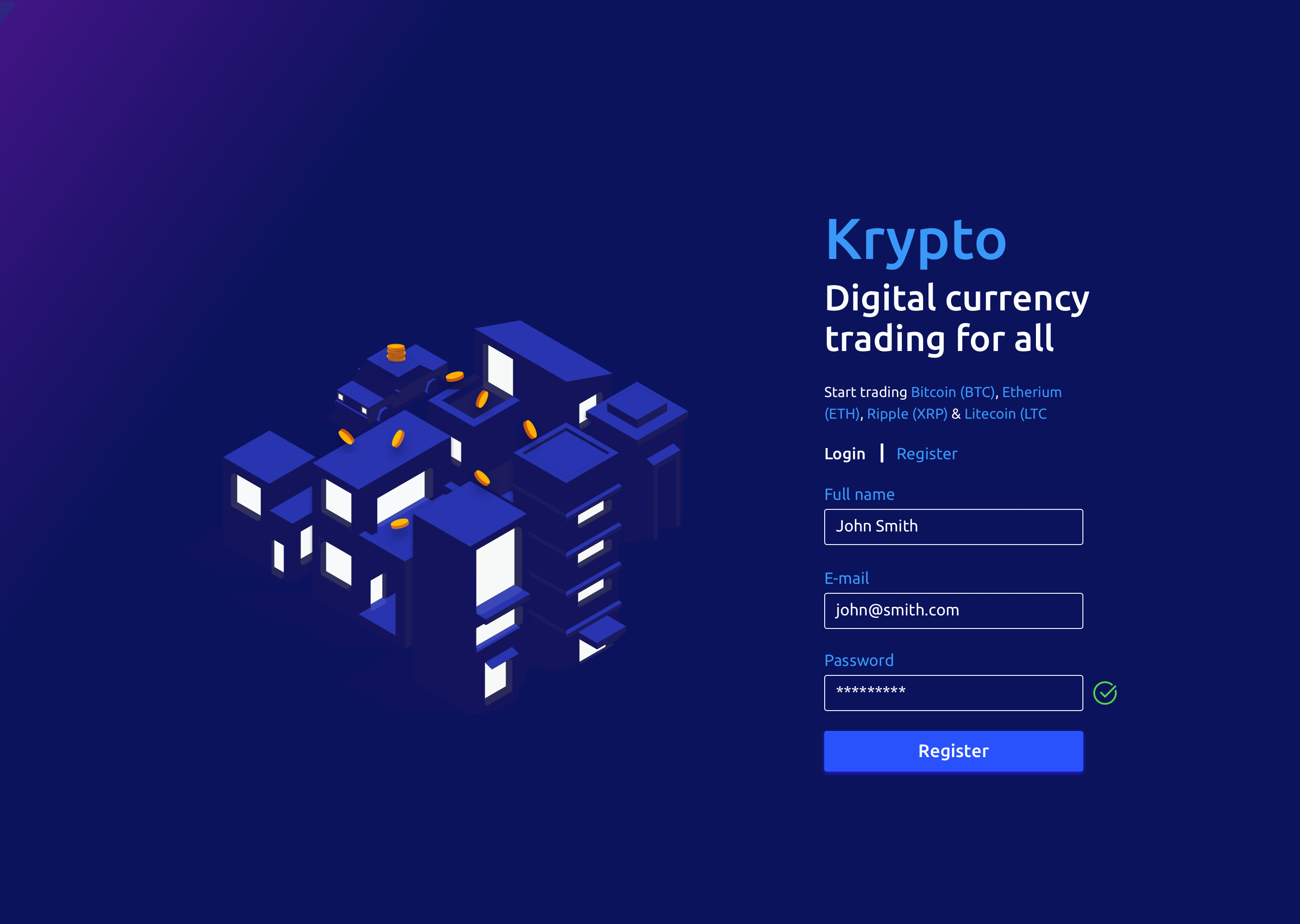
During the design stage there was a lot of experimentation involved and since the nature of the brief was very open ended, it was decided to adopt a bold and dark theme. The decision process for this selection can be seen in the section below.
For the brand name, a the client-given concept term was selected (Krypto). In addition, blue monochrome tones with very subtle gradients were selected in order to highlight the minimalist approach adopted in the design.
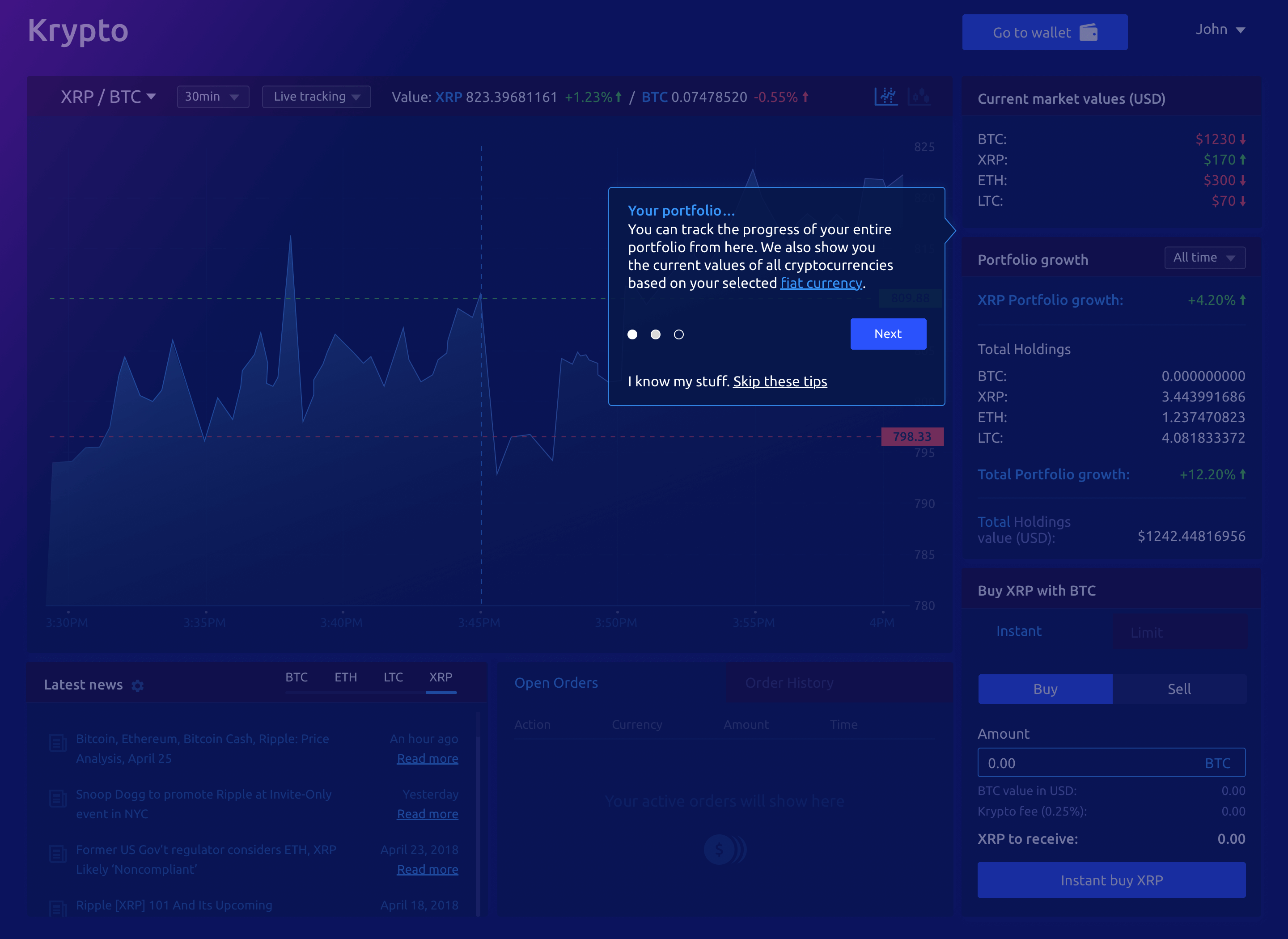
Dark vs white UI
Based on previous experience, it has been shown that users tend to prefer darker UIs when they have to use extensively a product that offers text and data visualisations.
Considering that part of the user base might be actively tracking their portfolio for extended periods of time, as well as opting for a full screen experience, a dark UI with light text and soft contrast will enhance readability and put less strain on the users’ eyes.
This soft contrast will also help in ensuring that the eye is drawn to the vital information needed. This will be particularly helpful for new users that might otherwise have a sensory overload and lack of focus.
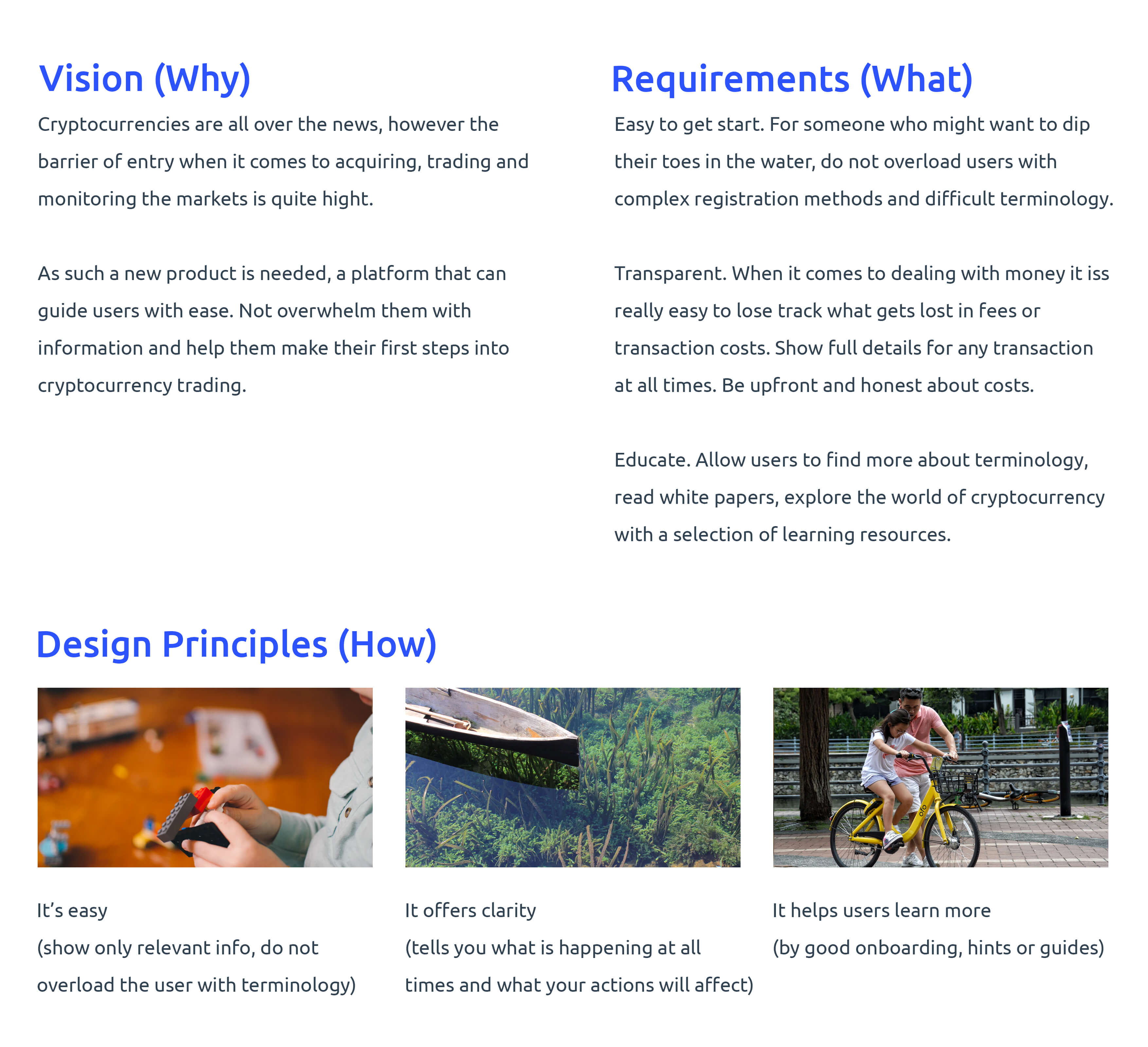
Design principles
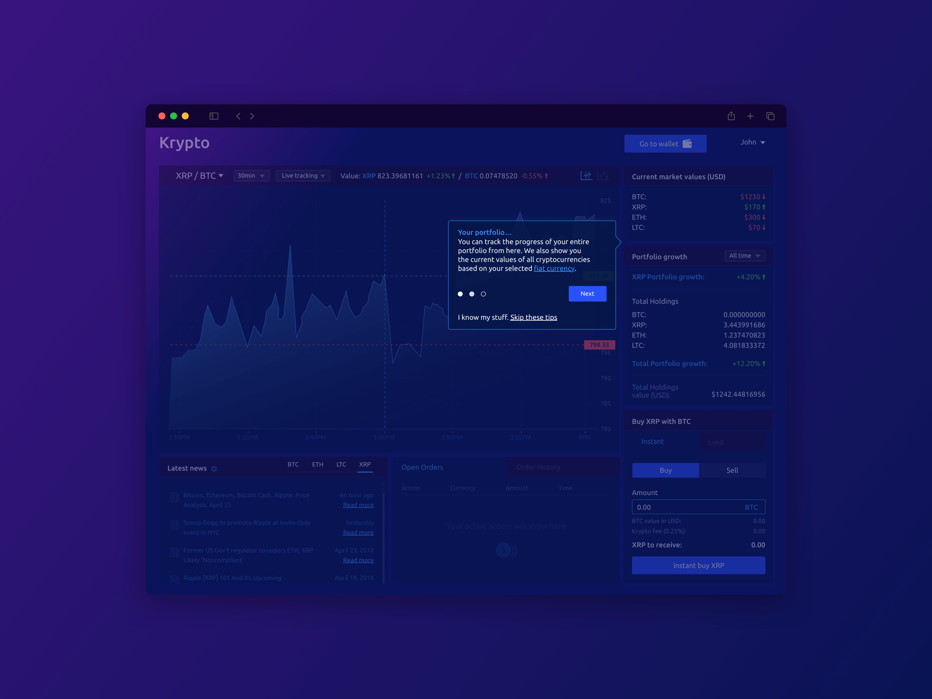
Following the rules defined on the design brief (see above) it was decided to adopt a minimalist approach as much as the product allows.
Considering the nature of the platform, the number of graphs, statistics and relevant information is limited only to what is considered an absolute necessity by the users (based on research findings above).
This to ensure that new and advanced users get vital information related to their activities, whilst avoiding cognitive overload with extra charts and projections that might be of secondary importance. Further actions and information (such as volume ordering) are “hidden” under visible dropdowns, this way more advanced users can adjust the information they have access to. Hence these advanced visualisations are a result of personal choice, rather than something thrusted upon users.
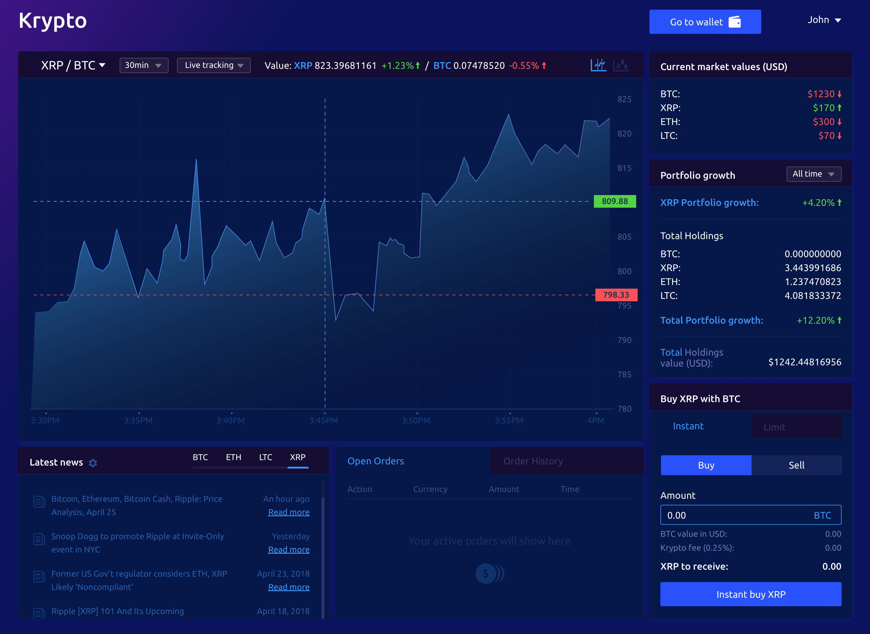
Information architecture and user flows
For the design principles to have an effect, there is a need to organise the importance of what represents “vital information” according to the users. Based on the research findings and user feedback the product features were hierarchically ordered. Ideally, this stage would include approaching users and have them perform card sorting exercises. However, knowing the time limit on this brief, I conducted the exercise on my own.
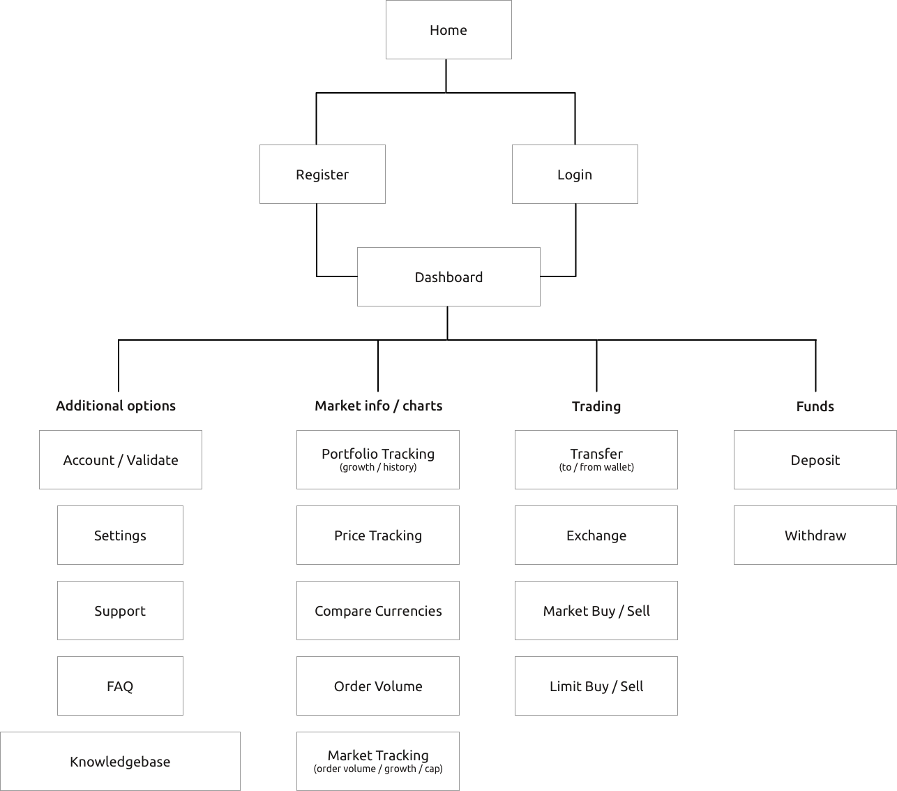
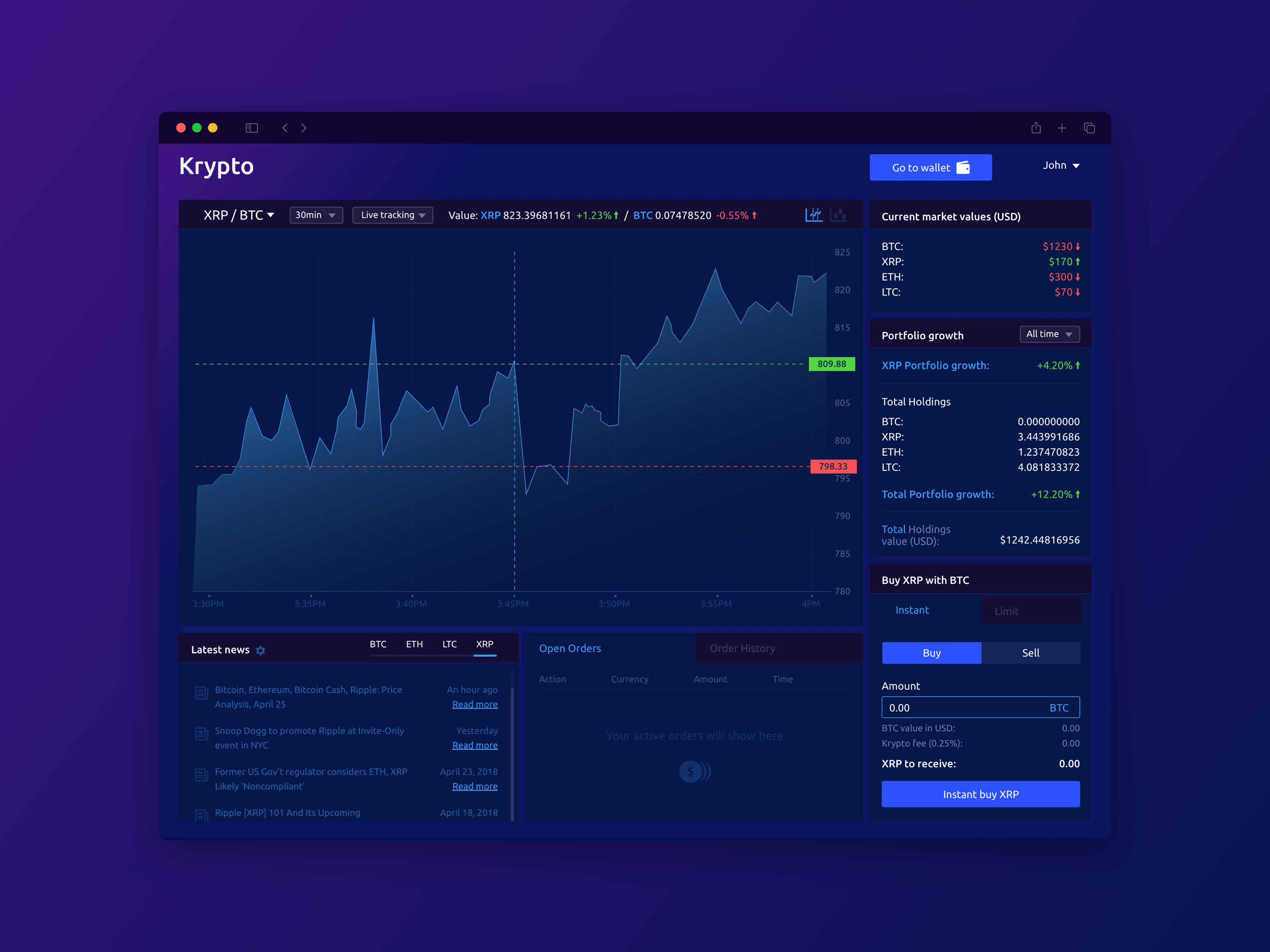
The user should be able to access all of the above through the dashboard. Some information is more readily available than other and this was dictated by previous research and key Red Routes.
As we will see later, Market info / Charts and Trading options were considered to be the most important for this product.
Low-fi Prototyping
Following all the preparation from above low-fi wireframes were created adopting the flow that can be seen below
The flow indicates the path of a new user, basic explanation of the product and introduces the early stages of getting into the cryptocurrency trading market.
All flows were designed as a web application used in desktop (based on survey results). Wireframes were also created to illustrate how a dedicated mobile app would look.
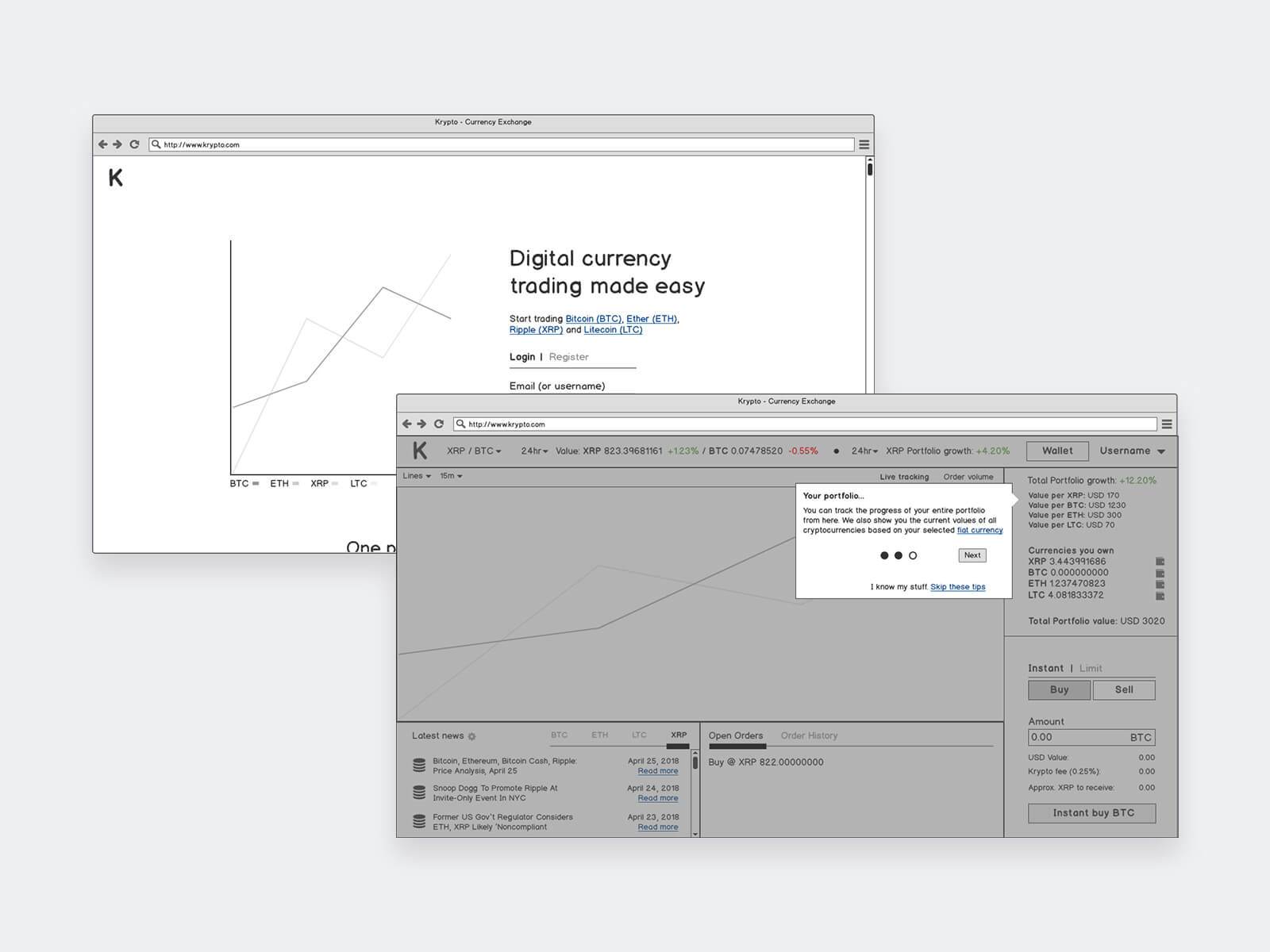
Link: https://marvelapp.com/2i169ee
Testing & validation stage
With the flow done ser testing was conducted in order to validate the design and flow.
Wireframe testing
Ideally a remote user testing should be planned (using a tool such as TryMyUI) but time restrictions did not allow for that.
Instead, paper prototypes from the screens designed were created and three individuals were asked to set up a new account within the platform and go through the necessary first steps of using the product.
Overall feedback was positive, with some comments in regards on information displayed as well as the request for more resources to be offered throughout the navigation of the application.
In summary, the three main points that came up during this guerilla user testing were:
- Consistent information in context: Offer stats and options for market tracking only within the dashboard. This to ensure new users do not get confused with added options.
- The ability to use the platform without validating an account. This to reduce the barrier of entry since users often do not want to give full disclosure of their information before trying something new.
- Offer the ability to users to read specific information per cryptocurrency. Things like white papers or reports that might educate the users to make a more educated decision.
UX Heuristics
Part of an ideal UI is conformity to NNG’s 10 Usability Heuristics. This is a collection of “rules” that according to NNG’s research every UI must conform to be successful.
By checking the wireframes against those rules, some minor issues were identified that were later corrected.
Experiences such as the ability to cancel an action, find relevant information and documentation, as well as to keep terminology consistent and easy to understand defined a superior experience.
Some other rules, like recognising and recovering from errors are out of scope for this project and have not been included in the low-fi wireframes or the final design
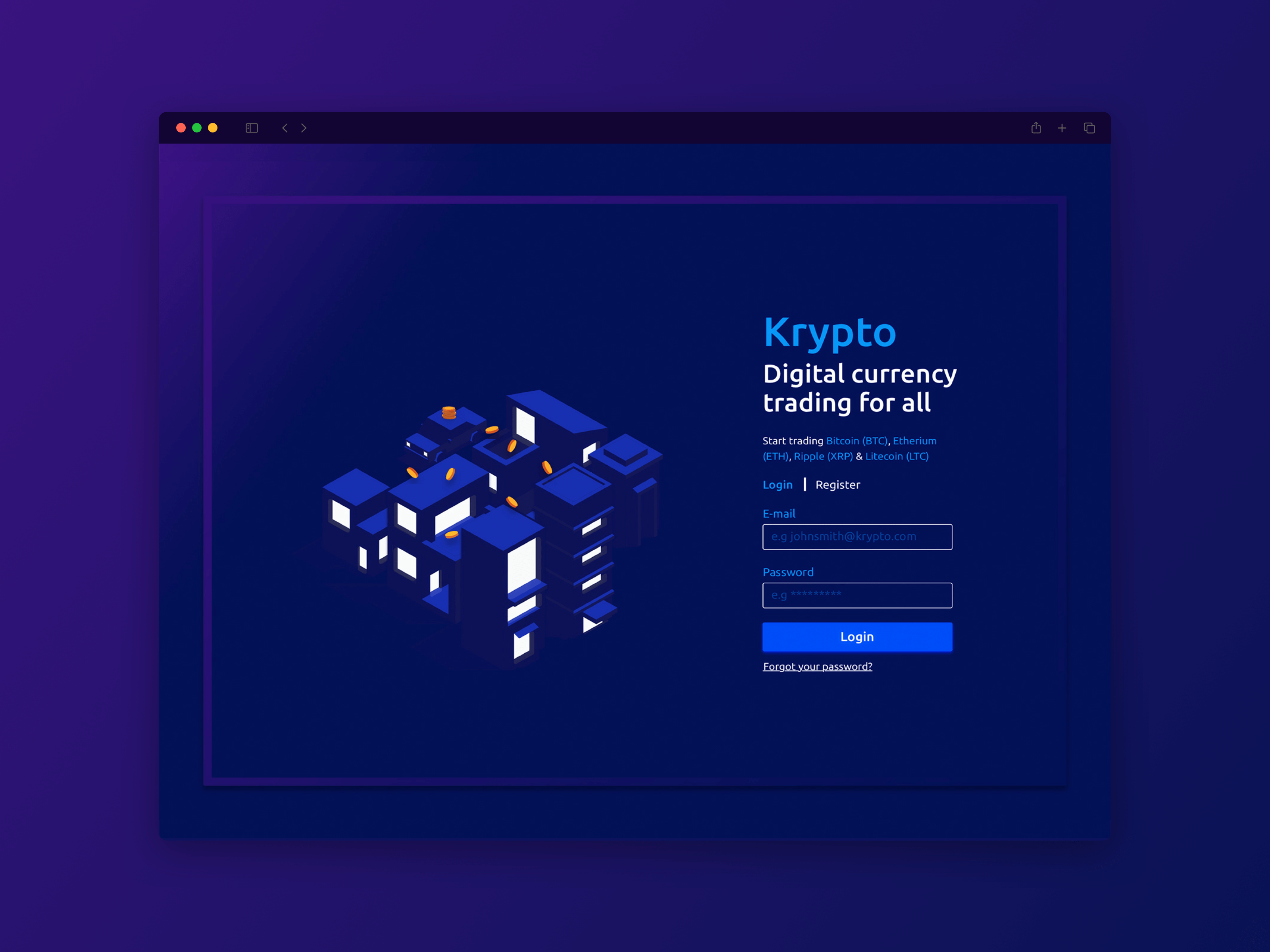
Hi-fi Prototyping
All designs were produced in Sketch. Prototypes of a simple login interaction and the dashboard onboarding can be found at: https://invis.io/2BHS5EYWDM4
Post MVP recommendations
As the spirit of the product is to introduce cryptocurrency to everyone, an ideal direction for this project would have been to produce a progressive web application, instead of a split between web and mobile applications.
Given the option, the mobile view would be created with a dedicated responsive view and an app icon, and not as a native application.
This to ensure that users in countries with low connectivity or bandwidth can still gain access to the application and use some of its features even if limited.
These limited offline features would be offered for users in “offline mode” with the ability to see market information since the last update, and perhaps the option to exchange and transfer funds asynchronously.
Another post MVP feature that should be offered to users is a degree of customization. Perhaps the ability to move visualizations or statistics around (like a widget system) or the options for light/dark theming could increase usability for users and allow them to setup the product around their needs and abilities.
All in all this has been an exciting and challenging project. An opportunity to hone my UX skills both in research and design. There are surely things that might have been missed or done differently with a larger scope. With time, a good team and a longer timeline this product that greatly introduce cryptocurrency trading to new (and advanced) users.
Case Studies