Livedrive - iOS Redesign
A much needed refresh to the iOS app
The challenge: Bring the Livedrive iOS app up to par with the latest iOS design guidelines and improve overall usability and UI
Platforms: Native iOS mobile application
Toolkit: User research, Balsamiq, Sketch, Invision, Zepplin
TLDR: A project, set to bring the outdated iOS Livedrive app up to date with current iOS standards.
Whilst at the same time improving the overall usability and experience for the users.
The application was suffering from older iOS mechanics and an overall inconsistency from other Livedrive applications. My role in this project was to conduct user research and in combination with our already collected data to make suggestions and improvements to the overall UI and usability of the application.
Research
We already had some user data and had a general idea of the users’ pain points. In order to collect more current and accurate data I created a user survey that drilled into the specifics of the application with both quantitative and qualitative questions in order get a more holistic view of the issues within the app.
I then compiled the results in a lean report, breaking down the main results and identifying the pain points in a list of issues that will need to be addressed (in stories) once prioritised.
Working with the product owner and the dev team I conducted several workshops to discuss these and our past results. We then identified the points that need to be addressed first in this new redesign.
The biggest pain points for users seemed to be browse-ability and find-ability within the app’s UI. Users overall expressed some type of difficulty when it came to easily browsing back and forth different views and finding the file they were looking for.
Navigation was considered cumbersome and required a lot of effort to preview and open files / hard to navigate on a small screen according to users.
Other issues were related to finding and sorting files in different views as well as navigating photos with ease and the use of thumbnails.
The survey also brought results related to the core functionality of the app with a few back end issues to be resolved. These were prioritised accordingly but are not part of this story.
Design
Wireframes
Small interactions and fixes applied to a UI can have an immediate effect on performance and usability. The wireframes created as part of this project aimed exactly at that; small layout fixes that offer an update to the UI to modern conventions and solves key user pain points.
Wireframing was a fairly straightforward task. Small fixes such as persistent navigation, different available file views and easier, more accessible controls made all the difference in the world. These, combined with modern design conventions such as adequate spacing between elements, made the new UI feel familiar yet refreshed.
Once the wireframes had gone through a few discussions and iterations with the team it was time for the high-fidelity design.
High Fidelity Design
Apple’s iOS guidelines provided some interesting but necessary limitations.
Apple’s new navigation controls helped to alleviate past issues with users getting lost within the app. Whilst at the same time the restrictions imposed on branding within the app made for an interesting challenge.
This challenge transformed into an opportunity for a turn to a more minimal aesthetic. “Clean”, with amble spacing and with colour used sparingly to draw the user’s eye to key actions or navigation elements.
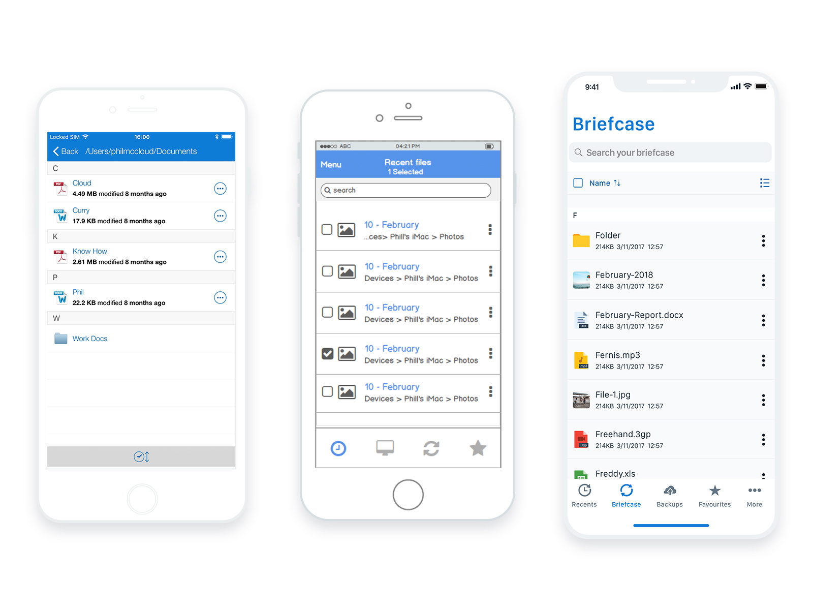
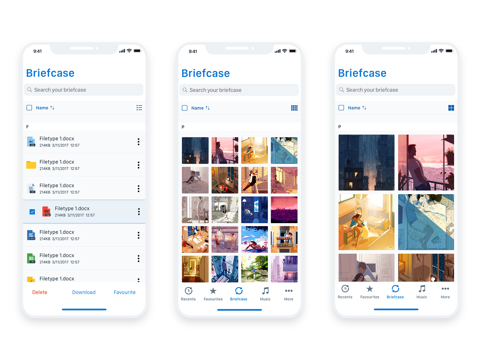
New file view is cleaner, spacious and easier to browse with additional controls and filters.
In this plain and “open” view, the user’s files & photos acted as the main protagonist. Besides the improvements in navigation and core view controls, this was another tiny change that helped in the user’s pain points with find-ability.
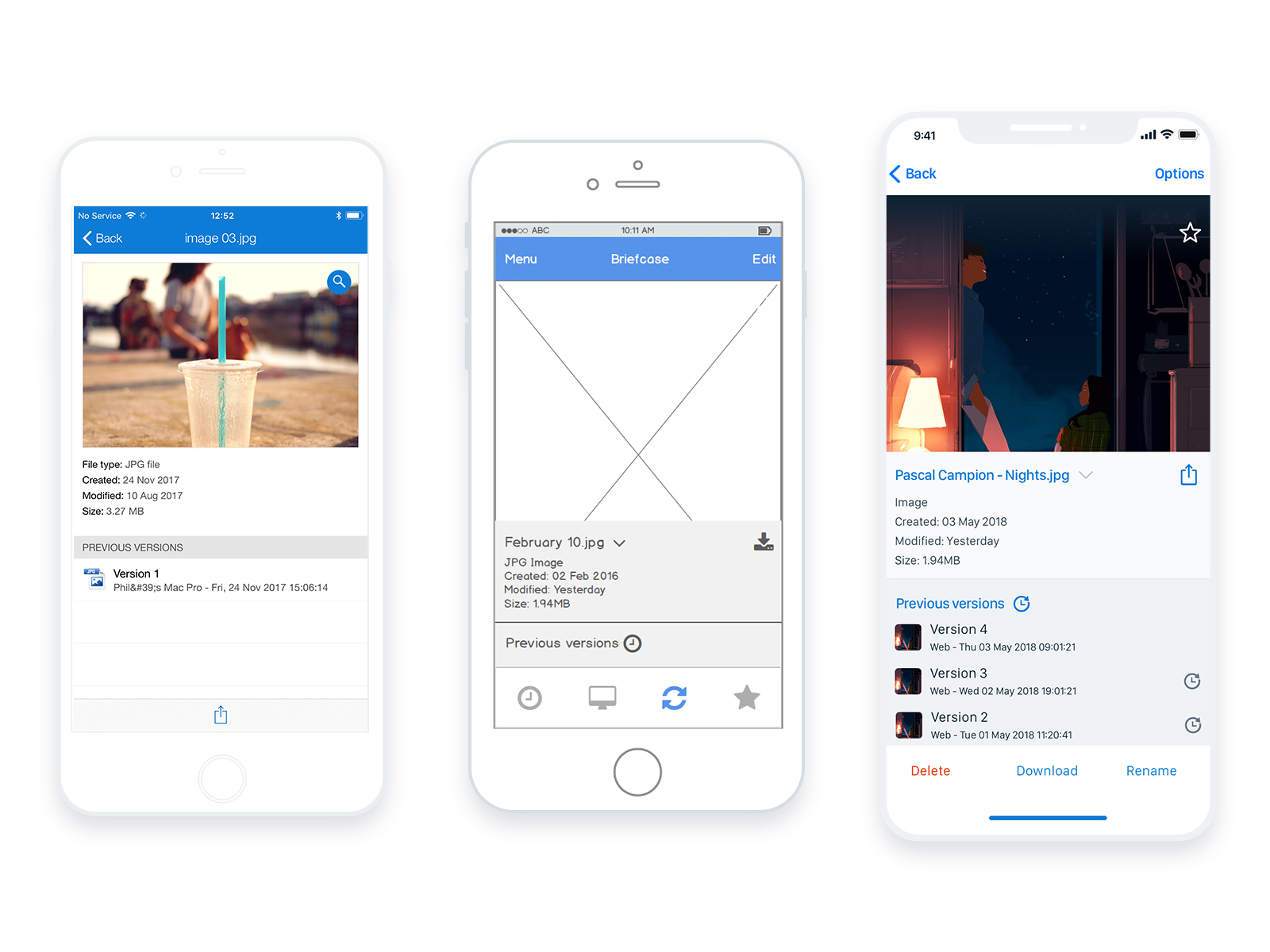
Individual file view became more visual and user actions more visible.
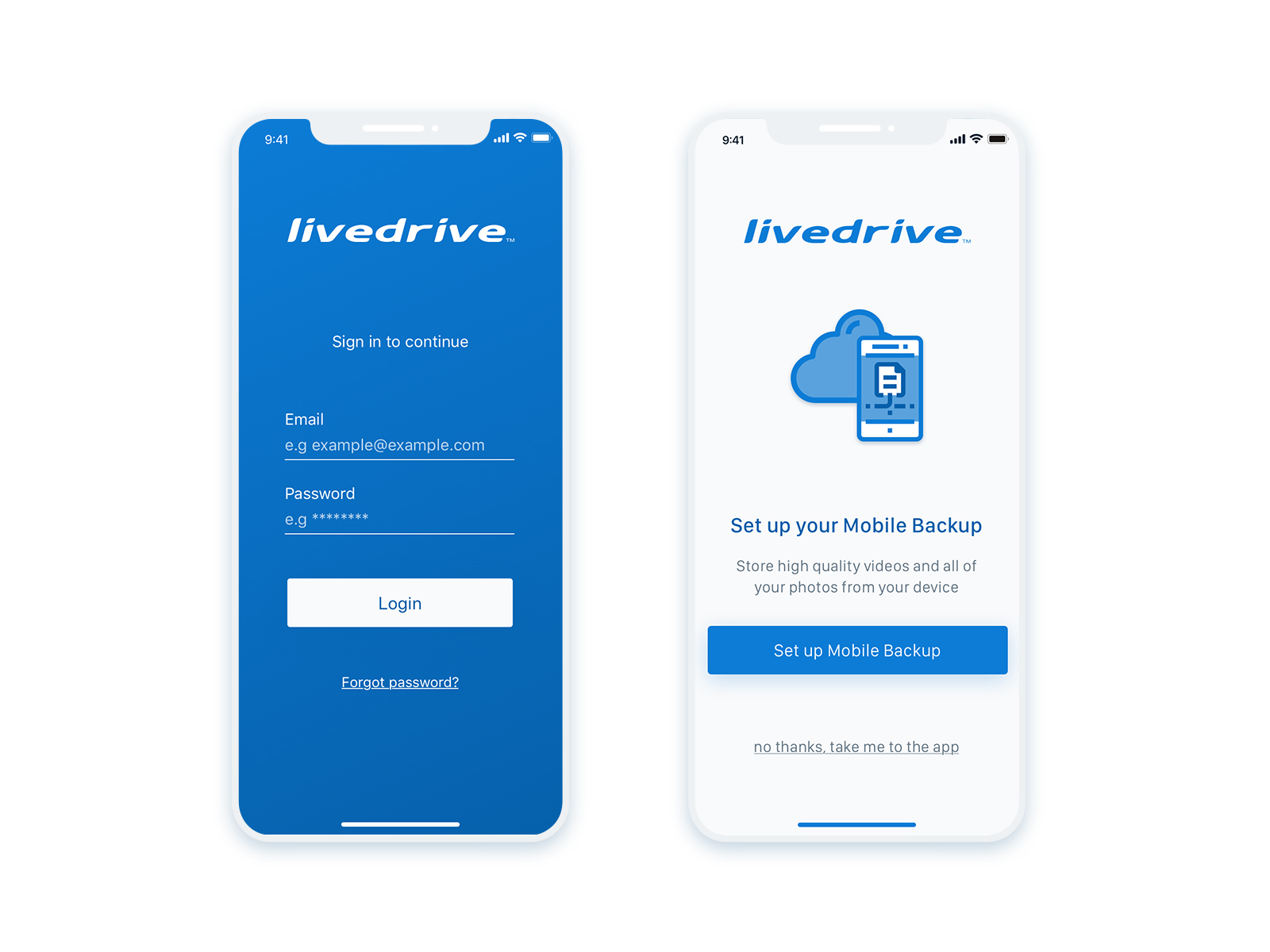
Backup set up in three taps
The on-boarding process was re-approached as well. With screens that guide the user it is now easier and faster to setup for new and existing users alike.
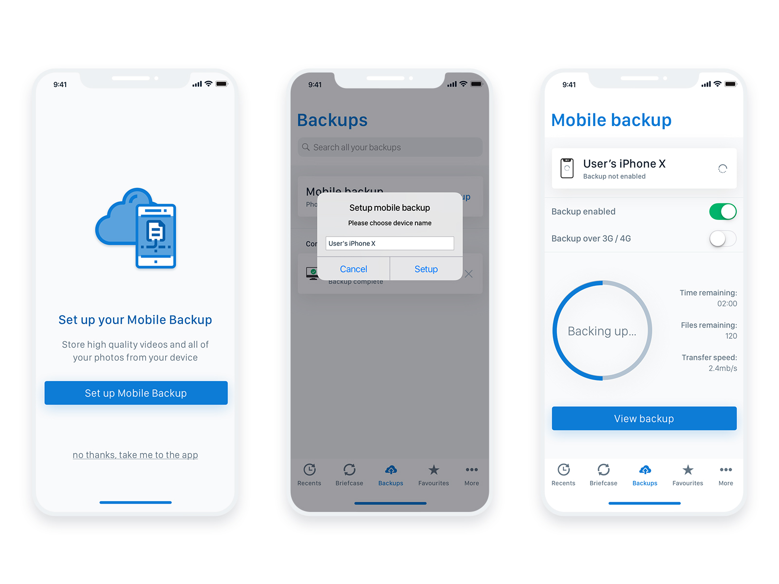
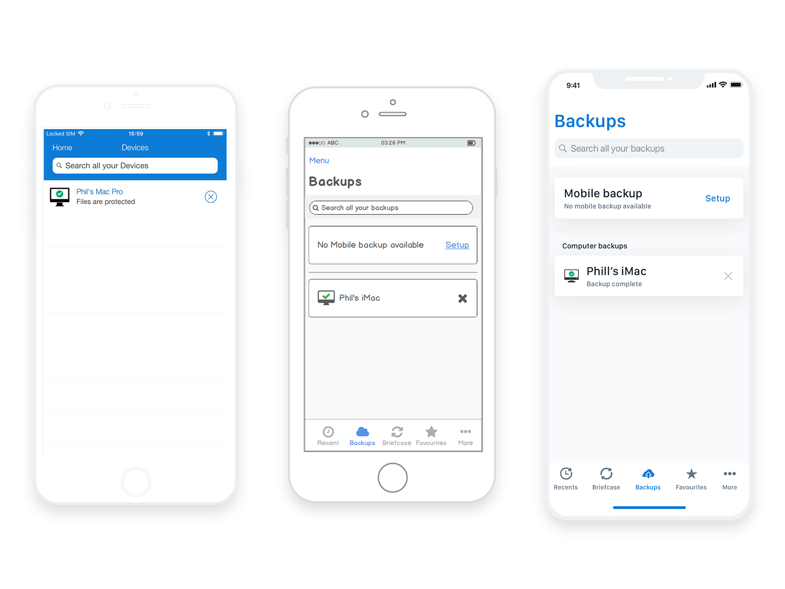
One screen, all backups. Available to manage, edit, remove and preview.
User Testing
The screens of the high fidelity prototype followed the user journey of a user backing up their mobile device and then deleting one of their files. These screens were joined in an interactive prototype which was then tested with users remotely.
You can explore the high fidelity prototype that was tested, here.
The results from testing indicated that the new UI is easier to use with the actions within the app being very straightforward to setup and follow.
As welcome as those results were however, there is still more testing to be done in the live environment once the update is released.
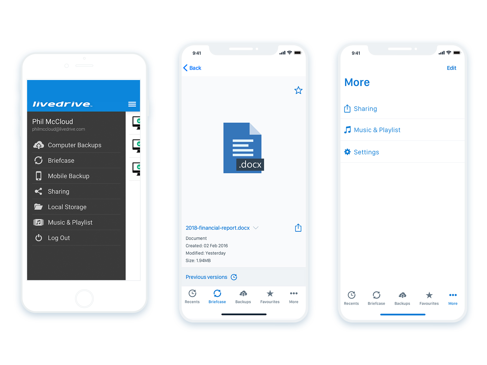
Navigation became persistent with additional or secondary options available yet tucked away.
Conclusion & next steps
This has been an entertaining project and a nice exercise in the restrictions of the new iOS. My biggest challenge was providing simple solutions to improve usability through the UI and of course justify this redesign beyond the aesthetics. The majority of the pain points, as were tested with the users after the design stage, were successfully solved and knowing this is was a great reward.
With the core UI being updated, next steps will be to do further testing. For potential new pain points that might arise and to ensure old ones have been solved. Plus looking deeper into user issues dependant on the back-end of the application and how they could affect the user experience.
Case Studies